Quick answer
Choropleth maps are the fastest way to visualize "where." They kill analysis paralysis by turning rows of data into instant geographic insights.
5 ways you win
- Compare instantly: Spot regional winners and losers side-by-side in seconds
- Pop visually: Trends and patterns jump off the screen—no spreadsheet required
- Tell stories: Give dry data immediate, real-world context that stakeholders understand
- Speak clearly: Maps are a universal language. Your team "gets it" without explanation
- Zero training: No specialist skills or data science degree needed. Just look and learn
Reality check
Be aware of these 3 limits to keep your data honest
- Detail loss: Broad regions can sometimes hide granular, local nuances
- Boundary locks: You are tied to fixed geographic lines (like counties or zip codes)
- Size bias: Large, sparsely populated areas can visually dominate small, dense cities (the "land doesn't vote" problem)
The bottom line: Use choropleth maps for speed and impact, but zoom in when you need the nitty-gritty details.
What is a Choropleth Map?
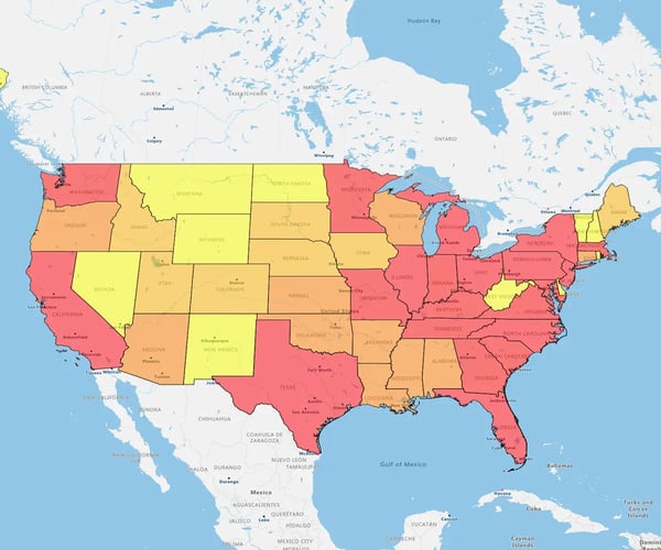
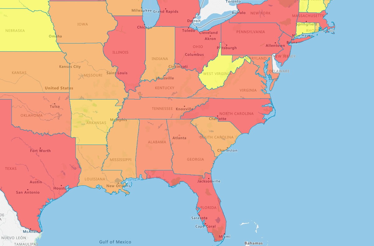
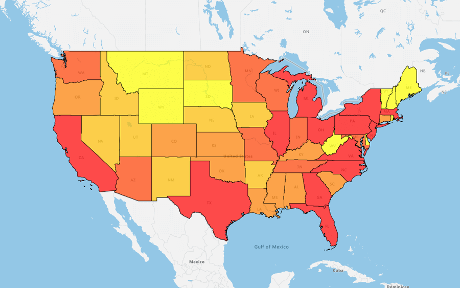
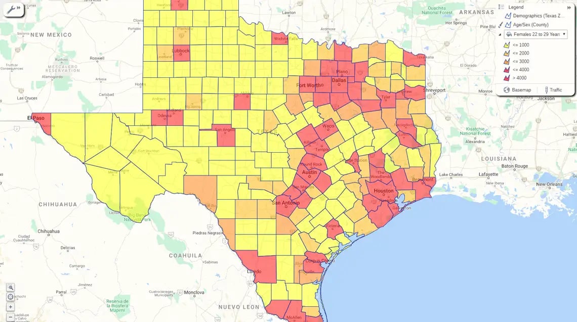
It is a map that uses color intensity to visualize data within specific boundaries—like ZIP codes, counties, or states.
It turns dense spreadsheets into instant visual patterns. You spot trends, outliers, and opportunities at a glance without needing a degree in data science.
How it works
- The input: You take a dataset (like household income or sales figures)
- The layer: GIS software matches that data to geographic regions
- The visual: Regions are colored in proportion to the value. Darker shades usually signal higher numbers (more income); lighter shades signal lower numbers
The impact: It marries your data to a location, instantly revealing the "where" behind your numbers.
What Does a Choropleth Map Show?
It displays aggregated data tied to specific geographic regions.
What you can track
- Demographics: Population density and income levels
- Performance: Regional sales figures
- Strategy: Customer concentration and market penetration
It empowers you to spot hidden business patterns instantly. You stop reading rows of data and start seeing the story behind the metrics.
What Are Choropleth Maps Used For?
To visually communicate data with a geographic component.
How it works: It maps variable values across a specific area, like a state or sales territory, using color gradients.
5 strategic uses:
- Track performance: Visualize sales results across different territories
- Segment markets: Pinpoint customer density and target specific demographics
- Spot trends: Identify high-growth zones or at-risk regions instantly
- Optimize resources: Allocate budget and staff exactly where they are needed
- Measure impact: Evaluate the geographic reach and success of your campaigns
They are versatile storytelling tools that turn location data into business strategy.
5 Choropleth Map Advantages
For ops, marketing and sales teams, choropleth maps unlock several compelling benefits compared to tables of numbers alone. Some of the most persuasive choropleth map advantages in sales and marketing include:
1. Compare Instantly
Maps let you scan multiple regions at a glanc, something spreadsheets simply can't do. You stop wading through "reams of data" and start spotting outliers immediately.
How it helps
- Speed: Marketers spot patterns fast, skipping the analysis paralysis of raw numbers
- Context: You see the spatial relationship between high and low performers instantly, revealing where you are winning and losing
2. Patterns Pop
Distinct color gradients make trends literally "jump off the page". Your eye is instinctually drawn to darker shades, meaning you spot anomalies and correlations instantly.
The upside
- Undeniable insights: Unusual clusters become obvious, sparking new hypotheses fast
- No training needed: You don’t need a degree to see the story. Even non-analysts can see exactly where the "heat" is
3. Add Context
Numbers alone are abstract. Mapping them gives them real-world relevance. You stop looking at isolated stats and start seeing relationships between location and performance.
How it works
- Reveal the hidden: Spatial data exposes connections that spreadsheets miss
- Layer insights: Overlay your metrics with third-party intel—like demographics—to see why a region performs, not just how
4. Tell a Story
Maps convert "mountains of raw facts" into a digestible visual story. Data alone is dry. Choropleth maps engage the room instantly, helping even non-analysts grasp the takeaway at a glance.
The impact
- Universal language: You synthesize complex insights into a format everyone understands—no translation required
- Pitch perfect: Whether it is a sales presentation or a board report, interactive maps make your argument undeniable
5. Zero Training
Modern mapping tools like eSpatial democratize GIS. You no longer need a degree to unlock location intelligence.
Why it matters: It is perfect for busy sales and marketing teams who need answers now.
The upside
- Novice-ready: Even first-time users can leverage location data instantly
- Scannable: Because the graphics are simple, you spend your time acting on insights, not learning software
Choropleth Map Limitations
Maps are powerful, but no single report captures everything. Be aware of 3 specific traps.
1. Detail loss
Aggregating data to broad regions can mask local hotspots or outliers. You lose the nuance of the street-level view.
2. Rigid lines
You are tied to fixed boundaries (like ZIPs or counties). These arbitrary lines rarely match natural market seams or customer behaviors
3. Size bias
Large, sparsely populated areas visually dominate the map, while dense, high-value cities appear tiny. (Data analysts call this the "land doesn't vote" problem.)
Choropleth Maps Vs. Others
Choosing the right map matters. Here’s how choropleth maps stack up against heat maps, isopleths, and cartograms:
Comparison 1
Choropleth Vs. Heat Map
Don't confuse them. One respects boundaries; the other ignores them.
1. Choropleth (The Container)
- How it works: Fills specific geographic regions (ZIPs, counties, states) with color based on value
- Best for: Data tied to fixed administrative lines, like sales territories, election results, or tax jurisdictions
- The look: Structured, precise, report-ready
2. Heat Map (The Cloud)
- How it works: Uses "density kernels" to create smooth, glowing hotspots that bleed across borders
- Best for: High-volume point data, like foot traffic, crime incidents, or delivery concentrations
- The look: Organic, fluid, intense
Comparison 2
Choropleth Vs. Isopleth
It comes down to boundaries. One respects them; the other ignores them.
1. Choropleth (The Box)
- How it works: Segments data by specific areas (counties, ZIPs). The value changes abruptly at the border
- Best for: Discrete data tied to jurisdiction, sales figures, tax rates, voting results
- The visual: A patchwork quilt of colored regions
2. Isopleth (The Wave)
- How it works: Draws contour lines to connect points of equal value, creating smooth gradients that flow across borders
- Best for: Continuous data, temperature, elevation, barometric pressure
- The visual: Flowing lines and smooth transitions (think of a weather map on the news)
The bottom line: If your data stops at the state line (like laws), use a Choropleth. If your data flows over the line (like rain), use an Isopleth.
Comparison 3
Choropleth Vs. Cartogram
It’s a choice between geographic accuracy and data magnitude.
1. Choropleth (True Earth)
- How it works: Keeps geographic boundaries exactly as they are on a map
- Best for: Familiarity. You want users to recognize the "boot" of Italy or the shape of Texas instantly
- The trade-off: Big, empty states can look more important than small, dense cities
2. Cartogram (The Amplifier)
- How it works: Resizes regions based on the data value. High-sales areas get physically bigger; low-sales areas shrink
- Best for: Shock value. It forces the viewer to see magnitude over geography (e.g., making a small but profitable city look massive)
- The trade-off: The map looks warped, which can confuse users trying to find specific locations
The bottom line: If you need people to find a location, use a Choropleth. If you need them to feel the weight of the data, use a Cartogram.
When Should Sales and Marketing
Teams Use Choropleth Maps?
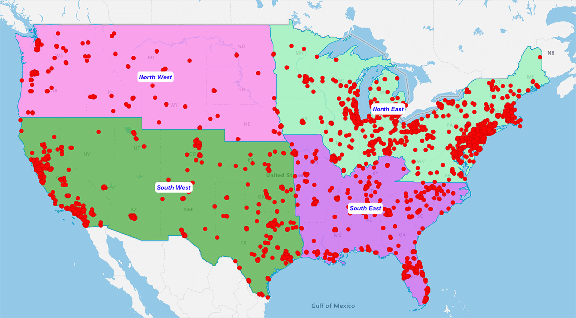
Deploy choropleth maps when you need to:
- Compare territories with sales territory mapping software
- Achieve territory optimization for balanced workloads
- Communicate insights to marketing and sales teams
- Leverage visualizing spatial patterns using cluster maps
- Integrate marketing mapping software into campaign planning
Create Insightful Business
Maps With eSpatial
Unlock the full choropleth map experience with eSpatial’s platform.
-
Optimize sales territories and routes
-
Analyze campaign performance fast
-
Improve field planning and increase coverage
-
Visualize spatial patterns for deeper, location-based insights
Transform your quantitative data into strategic action. Start your free eSpatial trial today and harness the power of location intelligence!
Frequently Asked Questions
What is the Main Purpose of a Choropleth Map?
To visualize data across specific geographic boundaries. It answers "Where?" by coloring regions (like counties or sales territories) based on data intensity. Darker shades usually mean higher values.
Choropleth Vs. Heat Map: Which Do I Need?
- Use a Choropleth if your data is tied to boundaries (e.g., "Sales by County" or "Tax Rates by State")
- Use a Heat Map if your data is loose and density-based (e.g., "Where are customers standing right now?")
Do I Need GIS or Coding Skills?
No. Modern tools (like Upleaf) democratize this. If you have a spreadsheet with location data, you can build a professional map in minutes without a single line of code.
What Data Format is Required?
You just need two columns:
- Location: ZIP code, county, state, or FIPS code
- Value: The metric you want to track (Revenue, Population, Leads)
Can I Map Custom Territories?
Yes. While standard choropleths use administrative borders (states/counties), advanced tools allow you to merge these into custom sales regions for precise territory management.