

eSpatial territory management software optimizes field resource utilization by converting text-heavy dispatch sheets into interactive geographic layers. This high-velocity spatial intelligence enables logistics leaders to eliminate territory overlaps.
Ambitious operations managers want faster, more intuitive tools to make confident, data-backed decisions. However, when multi-site networks and field teams are managed through flat Excel sheets, geography remains a hidden dimension that creates a massive, silent operational drag. On paper, the grid looks fine; in reality, it is a state of spreadsheet flux that masks severe resource imbalances and leaking fleet costs.
You simply cannot optimize field resources and maximize capacity without a map. By putting the map back at the center of your logistical execution, eSpatial transforms blind rows of text into a cloud-based visual intelligence layer, moving your organization from exhausting data wrestling to instant spatial awareness.
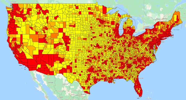
eSpatial regional heatmaps expose network capacity leaks by rendering location intelligence data as color-coded density layers. This instant visual processing empowers operations managers to identify underutilized field assets, recognize regional facility strains, and balance multi-site workloads efficiently without relying on complex automated routing algorithms.
The human brain is hardwired to interpret spatial patterns near-instantaneously, whereas analyzing raw database text imposes a high cognitive load that slows down decision-making.
When logistics leaders rely on pivot tables, they are operating with a cognitive blind spot. A route or branch workload that appears perfectly optimized on a spreadsheet can hide deep operational inefficiencies in the physical world.
-
 Visualizing The Unknown
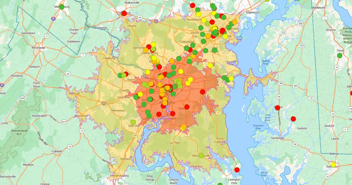
Plotting data records as interactive pin maps allows operators to instantly cross-reference field supervisor feedback with geographic reality, spotting high-density customer clusters and empty coverage zones within seconds.
-
 Exposing Network Capacity Leaks
Displaying site volumes visually shows managers exactly which service hubs are choking on overcapacity and which are starved for volume, making it easy to see where assets must be reallocated next.
-
 Proximity and Radius Diagnostics
Deploying precise radius tools and drivetime calculations helps operators run fast nearest-neighbor analysis, compressing asset network planning from a snail's pace to real-time execution.
-
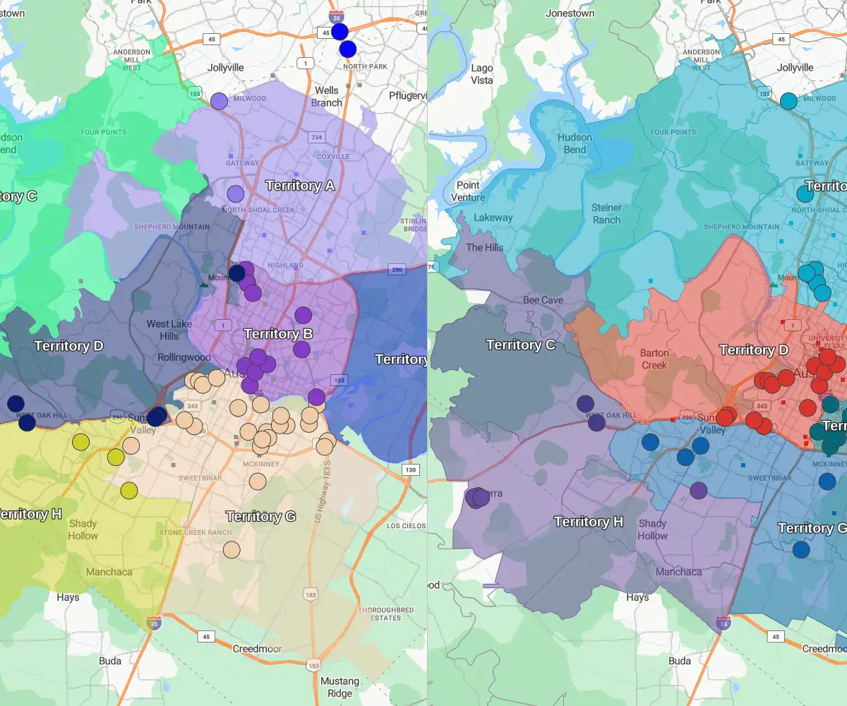 Dynamic Scenario Testing
Modeling proposed territory alignments as interactive visual layers empowers teams to safely preview the impact of resource shifts before deploying them to the frontline, eliminating the risk of accidental field overloads.
eSpatial route planning tools minimize fleet operating costs by optimizing multi-stop field travel paths. By replacing fragmented spreadsheet scheduling with dynamic geographic plotting, operations managers cut driver windshield time, maximize localized resource allocation, and capture thousands of dollars in annualized per-route savings.
The true value of mapping software is realized when visual diagnostic insights are converted into frontline fleet execution. Managing field teams through static text rows forces dispatchers to guess boundaries, causing massive route overlaps and skyrocketing mileage burdens.
For example, a single field route that spans 77 miles and demands seven hours and 30 minutes of daily travel time represents a major operational drain. When field service managers run that same dataset through a visual route planner, the hidden geographic friction is removed immediately.
Optimized Route Map Impact
By structure-routing that exact resource, the daily path drops to 40.8 miles and six hours and 46 minutes of travel time—representing a 47% reduction in daily mileage. When annualized across a single field vehicle, this visual adjustment reclaims 176 hours of productive capacity and drives $1,332 in direct fuel savings alongside $4,440 in non-fuel cost reductions.
eSpatial Territory Manager software balances regional resource networks through an intuitive visual workspace. This plainspoken mapping platform allows field coordinators to perform rapid manual adjustments and transfer ZIP codes or accounts instantly, removing the traditional industry reliance on expensive external GIS consultants.
Balancing resources across a multi-site network does not require enterprise software complexity or multi-month consulting deployments. Operations leaders managing regional hubs need an interface that is as simple to manipulate as an Excel sheet, allowing them to shift boundaries smoothly during live team collaboration sessions.


A customer operating in the multi-site repair space applied this exact visual approach to balance workloads across their facility footprint. By mapping center capacities geography-first, they easily identified locations with too much or too little capacity. This quick visual sense-check allowed them to redirect work equaling one additional repair job per day, unlocking $312,000 in new billing opportunities.
The exact same mapping strategy was used to analyze their logistics pipeline, allowing them to eliminate 20 unnecessary vehicle transfers per week at $150 per transfer, stripping out $156,000 in annualized transfer leaks.
Furthermore, by using maps to optimize a team of claim handlers processing 20,000 transactions a year, they shaved five minutes off each transaction—reclaiming 1,660 hours and securing $41,000 in administrative savings.
eSpatial Territory Manager eliminates implementation delays by combining an uncomplicated user interface with fully inclusive expert onboarding. This out-of-the-box deployment framework enables mid-market companies to import facility data, customize visual territory lines, and achieve immediate field productivity gains without hidden technical debt.
Operations leaders cannot afford software that introduces steep learning curves, messy implementation timelines, or heavy professional services costs. The eSpatial Territory Manager tier is designed to deliver enterprise-grade diagnostic mapping for an annual investment of $7,995, with absolutely zero deployment fees.
Because the platform is engineered to match the functional simplicity of a spreadsheet, teams can upload facility data and see an interactive fields-of-view layer within minutes. Best-in-class onboarding and training are fully inclusive, ensuring your frontline coordinators have direct access to friendly, fast human experts to solve real-world curveballs with absolute confidence.