Color Coded Map Tool


Unlock your sales potential and transform your data into actionable insights

Sign up for a free 14-day trial
Color coded map
What is a color coded map
Video transcript for What is a color coded map

A color coded map transforms your data into an insight rich visual decision making tool. And it's a great way to visualize and interpret complex data, which allows you to make more intelligent, data-driven, decisions faster and more confidently.

So for example, I have just color coded my pins to see my verticals and now I'm going to use the filter table to hone in on my healthcare customers in the Dallas area. It's a really simple and effective way to get the information you need to make better decisions faster.


What is a Color Coded Map?

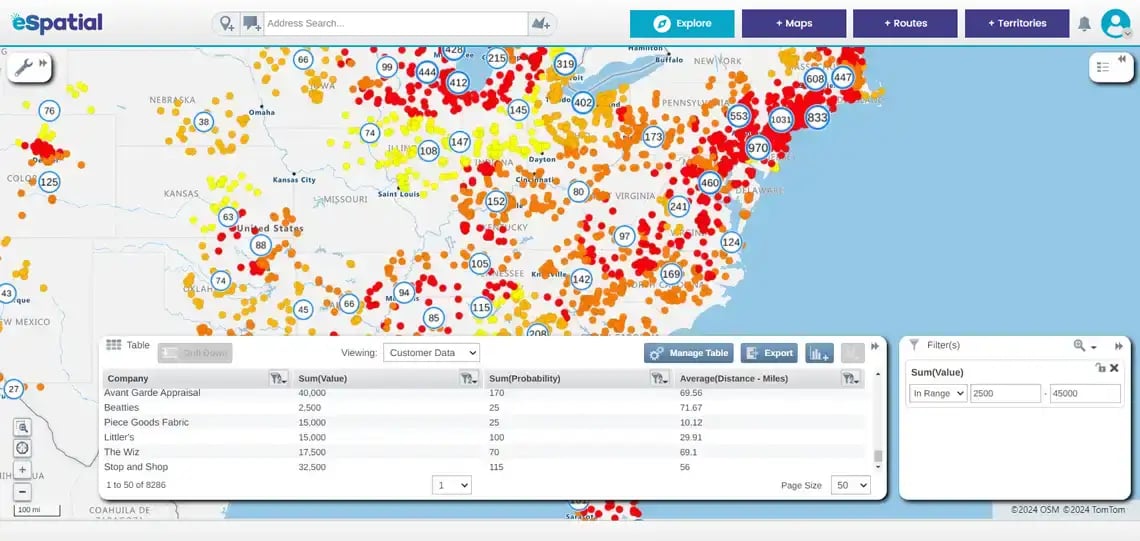
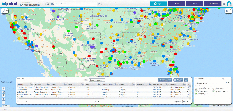
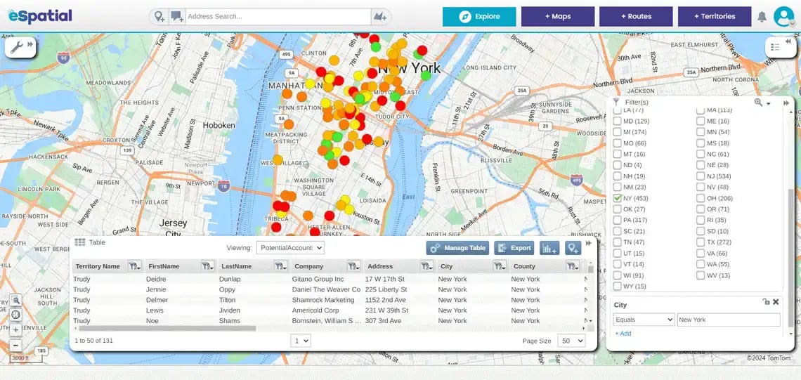
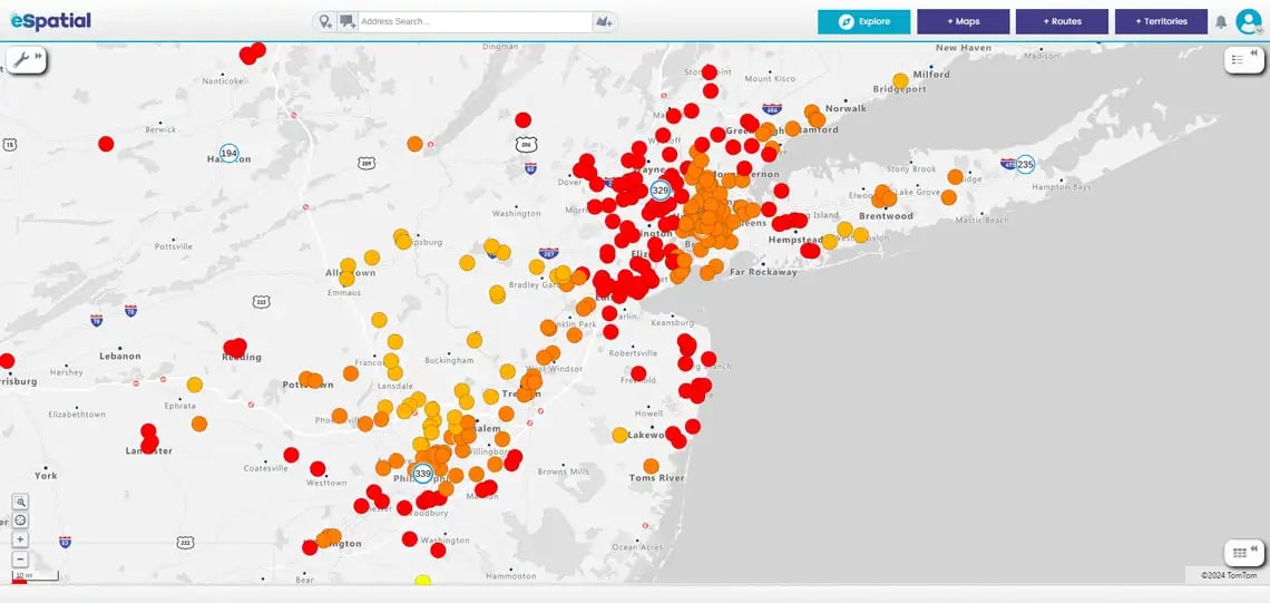
Our cutting-edge color-coded map tool empowers you to visualize and interpret complex data, making more intelligent, data-driven decisions faster and more confidently. Say goodbye to overwhelming spreadsheets and hello to clear, actionable insights.

Here's are some of the benefits of color coded maps:

Filtering data by specific US state

Intuitive Data Visualization


Easily identify trends and patterns with visually intuitive maps. Each data point is colored to signify different criteria like industry vertical, lead status, customer segment, distribution center types, and insurance claim category, making it simple to spot high and low-performing areas at a glance.

Filtering by sum total

Customizable Views


Tailor the map to your specific needs. Filter by ZIP, county or state, product line, or any other criteria to get the insights that matter most to your business.

Dynamic updating of data Dynamic updating of data

Visual Impact


Add data in seconds and gain immediate insight from your data. Monitor your sales or service performance and marketing impact.

Focus on data within New York city

Advanced Analytics


Dive deeper with our sophisticated analytical tools. Use heatmaps, pin maps, and bubble maps to uncover hidden opportunities and potential areas for improvement.

Analyzing location data

Performance Metrics


Our tool makes it easy to track key performance indicators (KPIs). It highlights the areas where you're excelling and where you need to focus more effort.

Leverage historical data to predict future trends. Anticipate market changes and adjust your strategies proactively.

Person using eSpatial mapping software on a desktop computer

User-friendly Interface


No GIS expertise is required. Our intuitive interface makes it easy for you or your team to use the tool immediately. Allocate your resources more effectively by pinpointing high-potential areas that need more attention.

Marketing team viewing pin map on screen

Team Alignment


Ensure everyone on your team is on the same page with shared, easily interpretable data. Present your perfect sales pitch using color-coded maps to convey complex datasets as simple stories.

You appear to be offline at the moment, this notice will disappear once your device can connect to the internet again