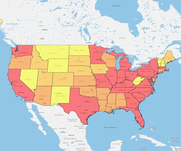
Quick answer
Adding maps to PowerPoint transforms flat data spreadsheets into a visual story that sticks. It turns complex geographic concepts into clear signals, helping audiences grasp sales territories, logistics, and market trends instantly.
The playbook
- Go static or live: Insert exported images for simplicity, or embed interactive web maps for real-time drill-downs (Windows only)
- Pick your lens: Use heat maps for sales density, pin maps for client locations, or bubble maps for multi-dimensional data
- Professionalize it: Layer custom data to upgrade your sales planning and market analysis slides
1. Insert a Map Chart
A map chart is a static, visual representation of data that links information to specific geographic locations. Here’s how to create it and insert the map in PowerPoint:
Step 1
Upload your data from Excel, a CSV file, or an existing dataset saved in the eSpatial data library using the Add Data button to map your Excel data. Once uploaded, our powerful mapping software does all the heavy lifting for you and automatically creates a map from your data points.
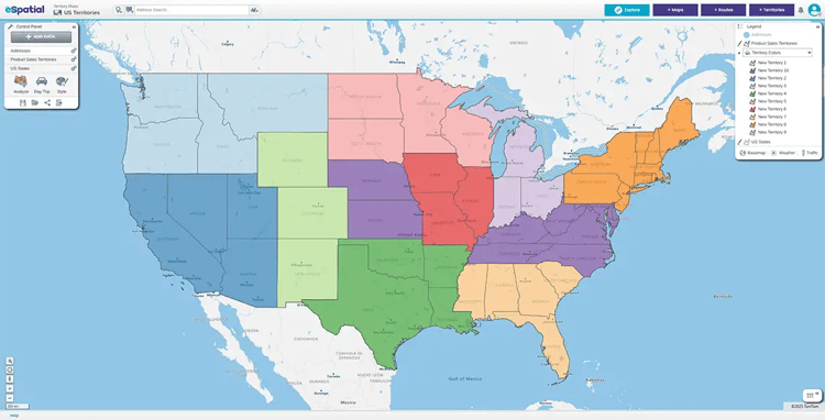
Step 2
Click on the Export icon in the control panel:
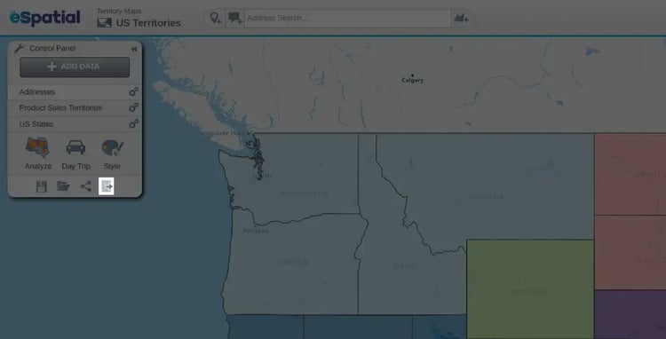
Step 3
Select Image and click the Download button:
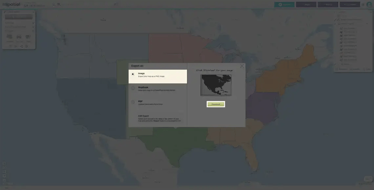
Your image will be saved to your Downloads folder with the default title "export.png".
Step 4
Open the page in your PowerPoint document where you want to insert your map.
Step 5
Click the Insert tab in PowerPoint, then Picture. Choose Insert Picture From This Device and select the image from your Downloads folder.
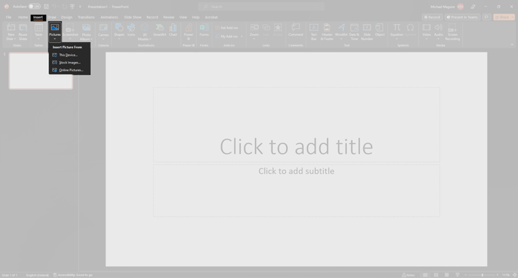
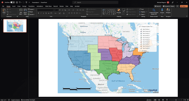
You'll then insert the map in PowerPoint using the JPEG format.
Click and hold on the map to reposition it or grab the corners to resize. You can also add explanatory text to the slide. Or, annotate it with PowerPoint tools (text boxes, arrows, etc.).
2. Embed an Interactive Map in PowerPoint
When you're building a presentation, you might want more than just a static image. You may want to show your audience a live, clickable, zoomable map right inside PowerPoint. While you can't create an interactive map in PowerPoint, you can embed one created with eSpatial, so it's interactive during your presentation.
Step 1
Import your dataset and choose your map type. This could be a pin map, a territory map, or a heat map. Create a color-coded map or customize the map with filters and labels as needed.
Step 2
Once your map is finalized, get the URL of your eSpatial map by clicking the share button on the control panel. Then, choose the option Shared Publicly. eSpatial creates a web-hosted interactive map that updates dynamically if your data changes.
Step 3
Windows PowerPoint users can use add-ins like Web Viewer or LiveWeb to embed their eSpatial interactive map, allowing them to interact with the map inside PowerPoint. However, these add-ins are not available for Mac users. In Windows, open PowerPoint, go to Insert, and then Get Add-ins, click Add, and insert your map URL.
Step 4
If embedding is not an option, take a static screenshot of the map to display on the slide. You can then link the image to the interactive URL. Linking to the interactive version gives viewers access outside the slide deck.
Use Cases for PowerPoint Maps in Business
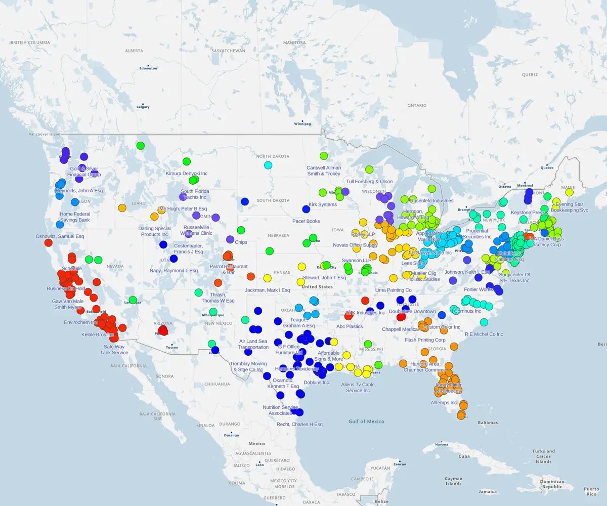
Adding a map to your PowerPoint slides provides an easy way to visualize and display your unique data within an engaging presentation. Instead of just listing client locations or sales territories, you can use your eSpatial map and add a striking visual element to your PowerPoint slides. Here are some popular use cases for our territory management software:
- Showing the locations of your highest volume or highest priority client accounts.
- Using heat maps in sales strategies by displaying your current sales territories based on region or individual sales rep.
- Mapping out the locations of your supply chain partners from end-to-end for the best visual representation.
- Highlighting the regions that include your highest concentrations of customers using heat maps.
- Identifying areas of potential expansion for your business.
For more tips on how to create a map for PowerPoint, check out our success stories to see how other businesses are using eSpatial.
Sales and Territory Planning
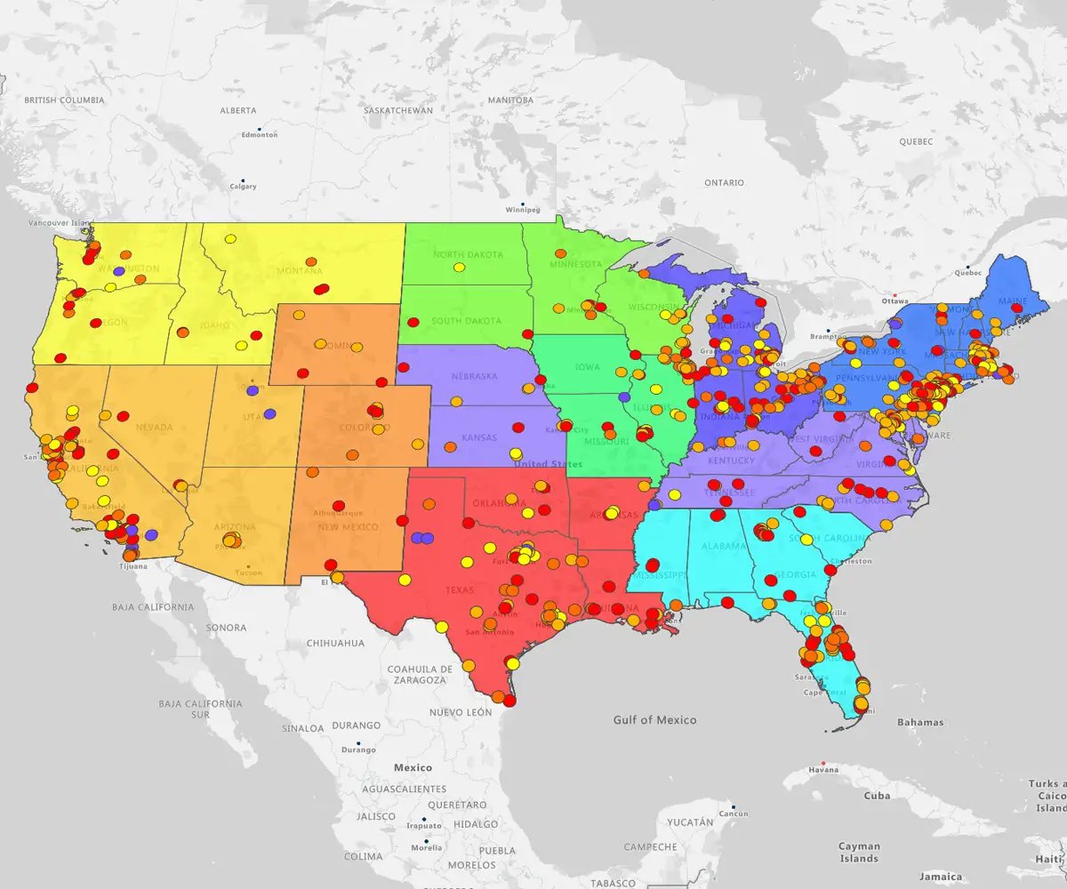
Using eSpatial's easy-to-use mapping software to build sales territory maps for PowerPoint makes it much easier to communicate complex sales data visually.
- Show reps their territories clearly, helping to reduce overlaps and gaps
- Visualize sales performance by region with heat maps, making it obvious where to focus effort
- Use radius maps to identify areas around key accounts for targeted outreach
Logistics and Delivery Optimization
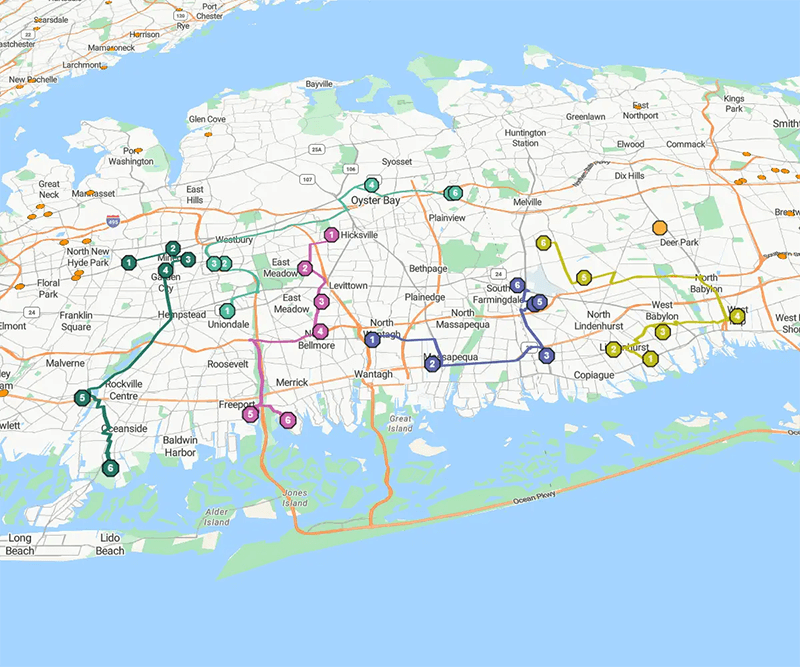
For logistics teams, visual maps may help plan and explain delivery routes, distribution points, and service areas.
- Build route maps in eSpatial to optimize delivery sequences and reduce travel time
- Use proximity (radius) maps to visualize coverage around warehouses or depots
Market Analysis and Expansion
When evaluating new markets or planning expansion, visual data tells the story better than spreadsheets ever could.
- Create heat maps to show demand density or customer distribution
- Use pin maps to plot competitor locations or potential new sites
- Present these maps in PowerPoint to help executives see opportunities and risks at a glance, leading to faster, better-informed decisions
Benefits of Using Mapping Software
for Creating Maps in PowerPoint
While there are many ways to add a map to PowerPoint slides, there are some significant advantages to using a mapping software tool like eSpatial. For example, you can:
- Include your unique data: A map that includes your sales team, client location, or other unique data makes a statement. And with eSpatial, you can select the individual color, icon, and details associated with each pin on the map.
- Fill in gaps with eSpatial's data library: In addition to knowing how to create a map for PowerPoint from your own Excel spreadsheets or CSV file, you can also incorporate third-party data that eSpatial acquires from accurate and trusted sources.
- Automatic and streamlined map creation: One of the advantages of using eSpatial's mapping software for PowerPoint is its ease of use. In just a few clicks, you have a custom regional or world map showing essential data points for your business.
Frequently Asked Questions
How Does an Embedded Map Make My PowerPoint Engaging?
An embedded map transforms static data into a live, interactive story for your leadership team.
Spreadsheets and static maps encourage passive viewing. An interactive map demands engagement and ensures your key message actually lands.
The capabilities
- Real-time analysis: Zoom into specific regions and filter data on the spot
- What-if scenarios: Answer VP questions instantly without leaving the presentation
- Collaboration: Turn a passive presentation into an active, decision-making session
How Can I Quickly Map Campaign Results for a Quarterly Review?
Embed a live, data-rich eSpatial map directly into your PowerPoint slide in minutes.
Your time is better spent analyzing results, not wrestling with design tools for days.
The workflow
- Upload: Input your campaign data (lead locations or conversion rates by area)
- Style: Customize the map to highlight key outcomes instantly
- Embed: Use the integration to place the live visual in your presentation, providing fast, professional proof of marketing impact
How Does an Interactive Map Win Buy-in for Realignment?
The embedded map helps you demonstrate the "why" behind your proposed changes, not just the "what."
A static diagram fails to convince leadership. Buy-in requires proactively addressing underlying questions about fairness and opportunity.
The advantage
- Click-to-prove: Click on territories live during the presentation
- Show balance: Instantly demonstrate workload balance and sales potential for each rep
- Build consensus: Use drive-time analysis to squash arguments about unfair travel burdens, securing the approvals you need
Is the Live Map Embed Reliable During Presentations?
Yes. The map is hosted on our secure cloud platform, not on your presentation slide deck.
High-stakes presentations demand stability. This ensures your key message flows without technical glitches.
The dual advantage
- Stability: The map embeds as a crystal-clear, high-resolution image, eliminating the risk of crashes or failure
- Interactivity: A single click takes you instantly to the live, filterable map in your web browser when you need to dive deep
How Will Adding Another Tool Solve Problems Instead of Creating Them?
eSpatial solves more problems than it creates by simplifying your workflow, not complicating it.
Why it matters: This tool eliminates the frustrating, time-consuming workaround your team currently uses to create map visuals manually.
The payoff
- Integration: Connects directly to your data source
- Automation: Replaces manual creation of static map images with a fast, repeatable solution
- Focus: Frees your team to concentrate on finding and presenting insights, not on data wrangling
How Can a Map Justify New Market Expansion?
A map tells a compelling business story, instantly pinpointing the exact market opportunity.
Spreadsheets show abstract numbers. The map provides tangible, data-driven visual evidence that convinces skeptical leaders.
The presentation
- Layer data: Overlay demographics, competitor locations, and customer clusters
- The proof: Present a heat map showing high concentrations of your ideal customer profile in an underserved area
- Outcome: This visual evidence justifies the clear ROI of the proposed investment
How Does Your Map Simplify Complex Logistics Data?
The tool makes complex logistical data understandable by plotting it on an interactive map.
Why it matters: Forget trying to explain proximity or distribution routes using tables. The map visually simplifies relationships between locations, supply chains, and service areas.
The impact
- Show, don't tell: Visually demonstrate how a new distribution center would reduce delivery times
- Optimal site: Pinpoint the ideal location based on workforce availability and transport links
- Outcome: Bridges the gap between technical data and clear business implications for everyone
Can I Get Powerful Insights Without a Massive Time Commitment?
Yes. The platform is designed for business users, ensuring you get maximum impact with minimum time invested.
Why it matters: You are measured on results, not on becoming a mapping expert. This eliminates the steep learning curve entirely.
The efficiency
- Speed: Create your first map in minutes
- Ease: Seamless data uploads and a user-friendly interface eliminate hours of manual work
- Result: Go from spreadsheet data to presentation-ready map in the shortest time possible


