
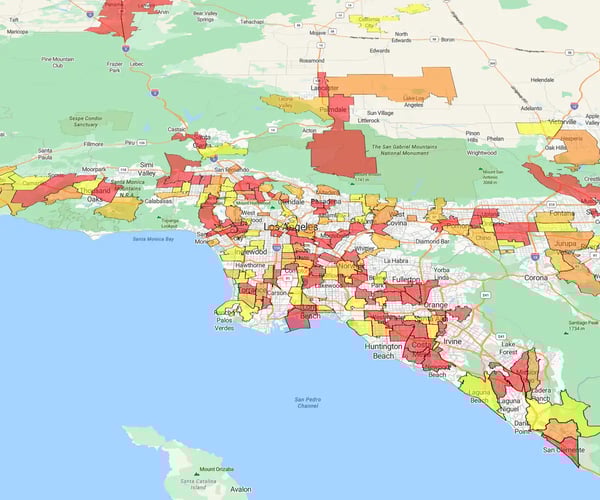
Color tells the story. Instead of staring at raw numbers, you assign colors to geographic regions (ZIPs, territories) to reveal performance instantly.
Speed to insight. You spot patterns in seconds that spreadsheets hide for hours.
The capabilities
- Visualize trends: See exactly how territories compare at a glance
- Spot gaps: Identify underperforming regions or coverage holes immediately
- Drive strategy: Back marketing and sales decisions with hard location data
This isn't a heat map (which uses intensity gradients to show density). This is thematic mapping, a precise way to compare distinct regions side-by-side.
eSpatial builds the map for you. You provide the data; the platform handles the geography.
Here's how:
Step 1
Clean Your Data
Your map is only as good as your spreadsheet. Ensure your file (CSV or Excel) has clear column headers in the top row.
The must-haves
- Location: Address, ZIP, or coordinates to place the pin
- Value: The metric you want to visualize (Sales revenue, Territory name, Customer segment)
Step 2
Import Map Locations
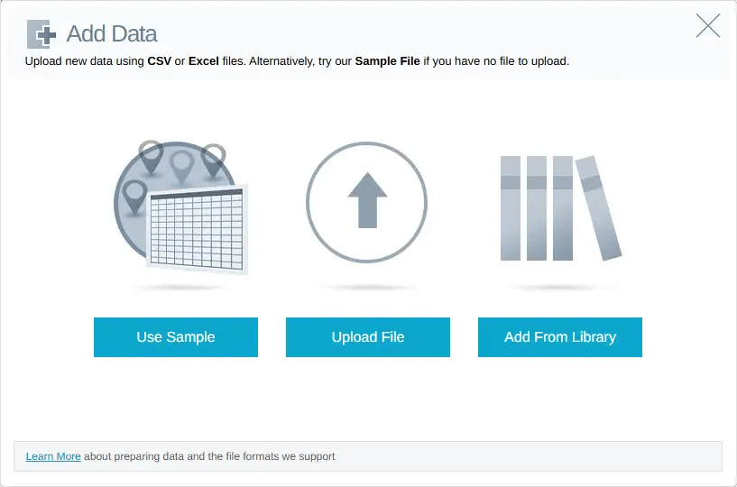
Log in to your eSpatial account and click Add Data, locate the file, open it, and upload it to eSpatial. When you upload a CSV file, you will be shown the location column(s) that the software has found within the spreadsheet.
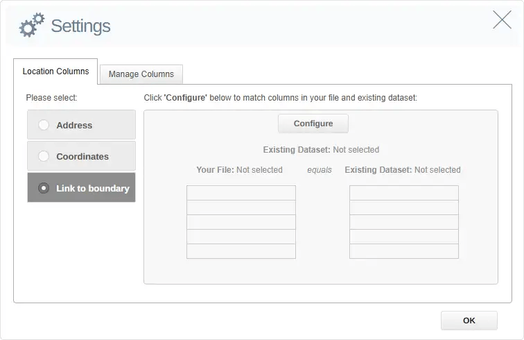
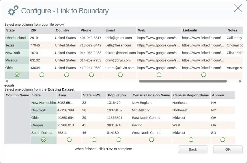
On the next screen, select the side-menu option Link to boundary and then click Configure. Select a geographic boundary dataset.
If the boundary dataset you're looking for is not in your Datasets list, simply click the eSpatial Datastore tab. Then scroll down or search to find the relevant boundary dataset, and click Select.
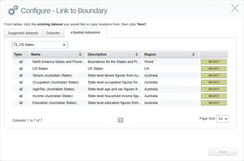
Click the Datasets tab again, and it should be added to the list.
The next step is to connect the data with the boundary.
Once you have selected my boundary dataset, click Next, which brings you to a panel where you can link a field in my dataset to a field in the boundary dataset.
Clicking OK returns you to the Settings panel, which allows you to confirm the boundaries you are linking:
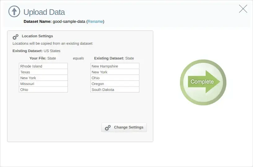
You will then be taken to another screen to upload the data and link it to the boundary dataset. Here, you can also give this combination of the uploaded dataset and boundary a new name. This will be useful if you decide to later plot a new layer of data on top of this new dataset.
All that remains to do is click Complete, and the upload process will begin.
Step 3
Choose Classification Method
After your data is linked to boundaries, decide how to color code your map based on what you want to show. In eSpatial, go to the Legend menu and click the paintbrush icon next to your dataset name.
This opens options to group and classify your data:
- Color by numeric range (e.g., sales, revenue, customer counts)
- Color by unique value (e.g., regions, teams, product types)
Choosing the right classification makes your data story clearer, whether you're highlighting performance, category differences, or coverage.
Step 4
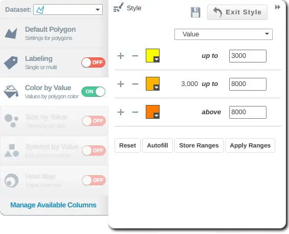
Assign Color Schemes
Once you've chosen your classification, it's time to pick the colors that will bring your map to life.
Click the Style button to open the Style & Color menu, then select Color By Value to see your options. Here, you can:
- Customize colors to match your brand or make contrasts clearer
- Choose shades that highlight key data patterns
After selecting your colors, click the save icon before closing the menu.
Step 5
Customize Map Appearance
Beyond colors, you can fine-tune how your map looks to make it clearer and more professional. In eSpatial, you can:
- Adjust pin styles, sizes, or shapes to highlight key points or categories
- Edit labels and tooltips to show the most important data at a glance
- Add or customize a legend so viewers understand what each color and shape represents
- Overlay additional layers, like boundaries or competitor locations, for extra context
Step 6
Export or Share the Map
When your color coded map is ready, you can:
- Export it as an image or PDF for reports and presentations
- Generate a secure shareable link to a live, interactive version of your map
- Copy the embed code to add the map to a webpage, dashboard, or intranet
- Export the underlying mapped data (with filters applied) to a CSV file for further analysis in Excel or another tool

Follow these best practices to make sure your maps are clear, accurate, and easy to read:
- Keep it simple: Don't overload your map with too many colors or categories
- Use meaningful colors: Choose colors that make sense to your audience (e.g., warmer colors for higher values, cooler for lower)
- Maintain contrast: Pick colors that stand out from each other so patterns and differences are easy to see
- Add a clear legend: Always include a legend explaining what each color means
- Test your map: Share it with colleagues or stakeholders to check if the story it tells is immediately clear
Knowing how to create a color coded map lies in balancing clarity, design, and the right choice of colors to tell your story at a glance. With eSpatial's easy-to-use GIS mapping software, you can bring your data to life and create maps that look as professional as they are practical.
Ready to create a color coded map? Check out our pricing and plan options.