

Sales heat maps aren't just for show. Top teams use them to solve specific density and coverage challenges.
What you'll learn
- Territory management: How to balance workloads fairly
- Map selection: Which visual style fits your specific goal
- Added context: How to layer extra data for deeper insights
A visual tool that uses color intensity to show sales concentration across geographic areas. Instantly identify where sales are strong, weak, or underperforming without digging into data tables.
Two Core Types
eSpatial's powerful mapping software eliminates guessing where revenue comes from. Visually pinpoint your most profitable regions to target resources where they make the biggest impact.
See it in action
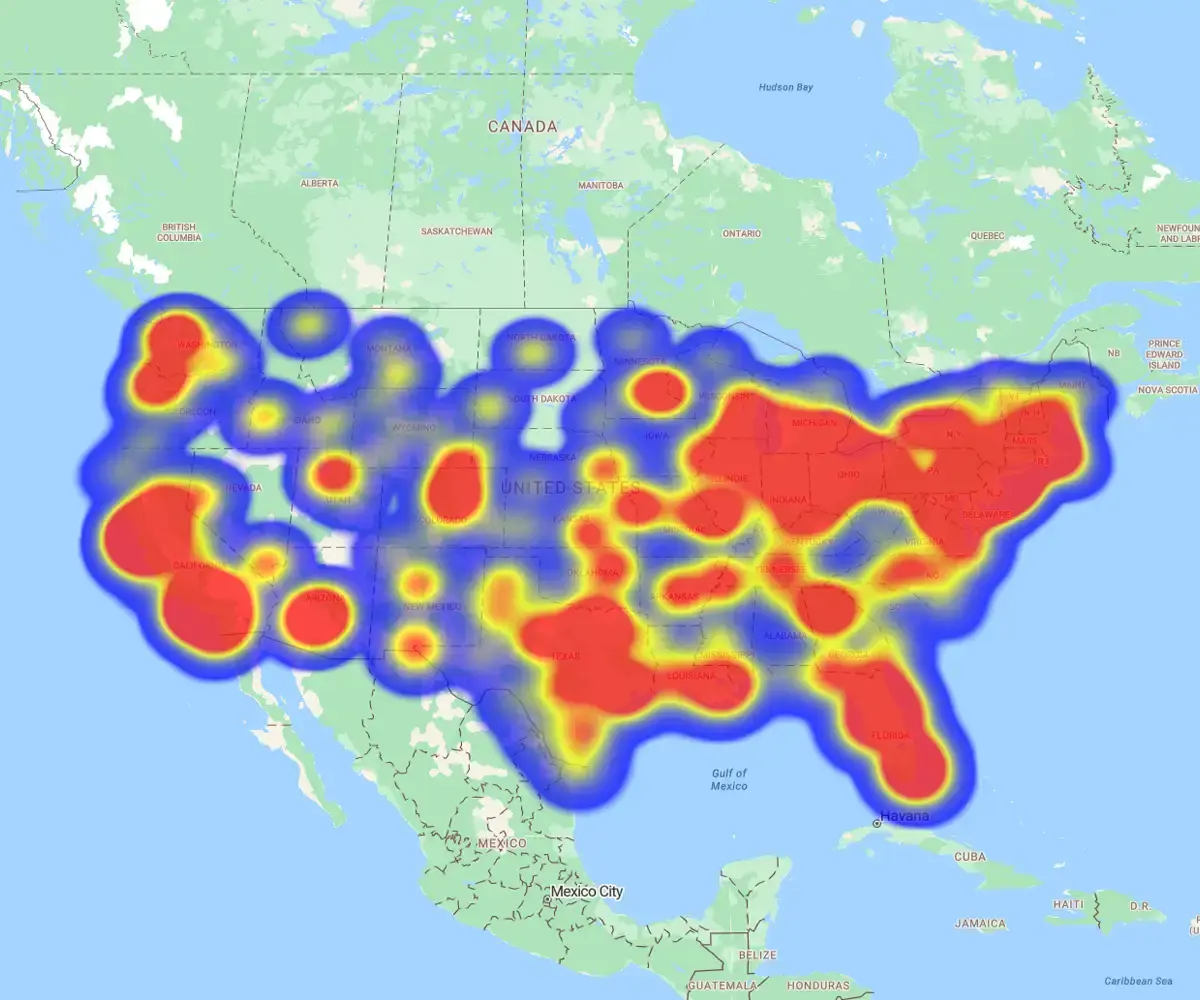
- Product A: Dominates the coasts, with hot spots in California and the Northeast
- Product B: Wins nationwide, with high sales density in Chicago, Detroit, and Dallas

Align sales with demand
The challenge: Are your reps where your revenue is?
How to check
- Hot Spot Maps: Overlay customer inquiries with rep locations. Instantly visualize your addressable market to spot coverage gaps or overlaps
- Regional Heat Maps: Color-code territories by sales value. Ensure resources are aligned with actual revenue, not just prospect volume

Go where the leads are
Don't waste travel budget on cold zones. Use heat maps to align resources with actual demand density.
The insight
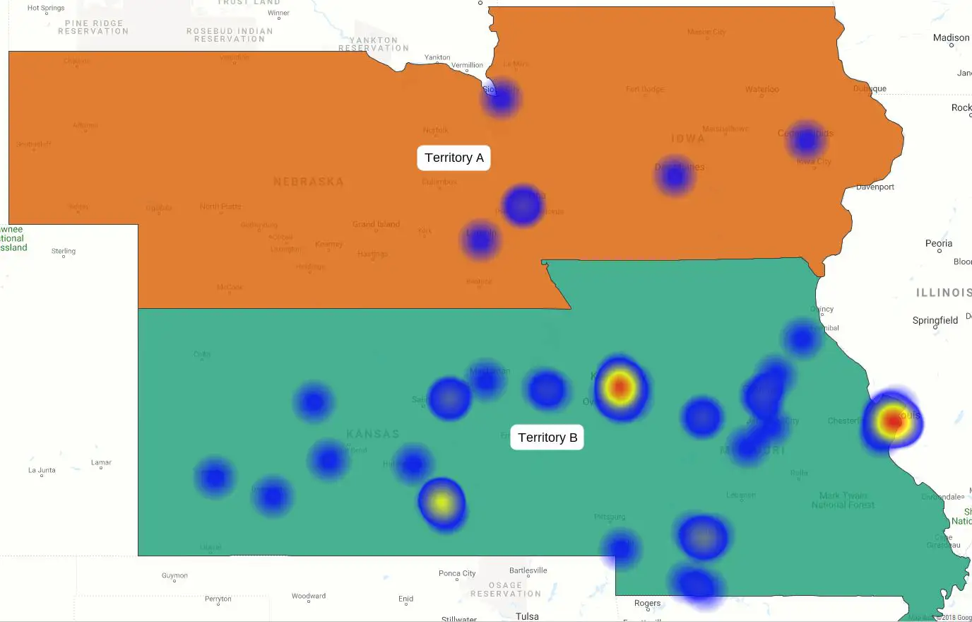
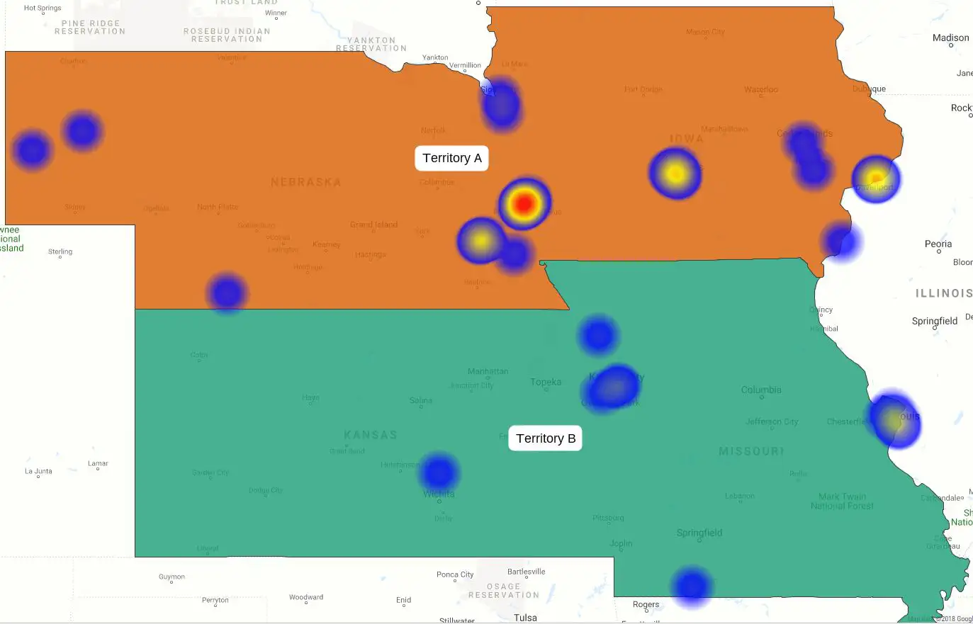
- Hot zones: The map reveals high lead concentration in Kansas and Missouri
- Cold zones: Nebraska and Iowa show sparse activity
The play: Prioritize trips to the high-density zones immediately.
Decide faster
Stop digging through spreadsheets. Use heat maps to visualize performance patterns instantly and act with confidence.
How it helps
- Visualize truth: Turn raw data into interactive maps that highlight trends, gaps, and outliers instantly
- Spot potential: Identify high-value zones to rebalance territories or redirect reps immediately
- Eliminate guesswork: Automate analysis to make faster, data-backed decisions across the sales cycle

Get the full context
Don't settle for top-line numbers. Layer in extra data to uncover the why behind performance.
See it in action:
- The illusion: Two reps show equal revenue
- The heat map: Layering customer volume reveals Rep 2 is handling way more accounts
- The deep dive: Filtering by product shows Rep 1 closes fewer, high-value deals, while Rep 2 pushes low-value volume
The fix: You stop guessing and start coaching—helping Rep 2 with upselling while rewarding Rep 1 for strategic wins.

There are many heat map use cases for sales and business. Move beyond theory. Use heat maps to solve specific sales and marketing challenges instantly.
Manage Territories
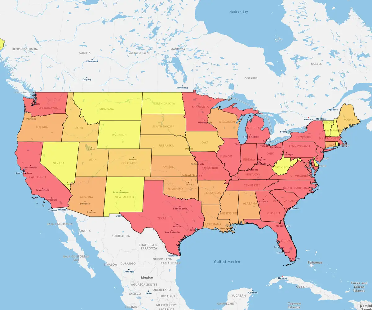
Effective territory management drives growth. Build and balance territories in minutes using ZIP codes or pipeline value.
Track Sales
Visualize product performance and regional density to spot hotspots.
Map Activity
Link contacts, orders, and opportunities to get a 360-degree view of every account.
Analyzing Campaigns
Overlay campaign results with demographic data to refine targeting and boost ROI.
Sales heat maps turn complex data into clear, actionable insights that drive smarter decisions. They help sales teams quickly spot trends, uncover opportunities, and focus on high-impact areas. With eSpatial, these insights are easy to access, share, and act on, fueling consistent growth.