• Data visualization

Draw a Radius Map: Step-by-step

Liam Costello
  • Published: February 8, 2021
  • Updated: November 21, 2025
  • Author: Liam Costello
  • Reading time: 10 mins
Radius map of USA

Quick answer

Drawing a radius with eSpatial exposes the hidden imbalances between reps with dense accounts and those driving endless miles. It turns distance into data, allowing you to adjust borders for fair quotas and realistic travel times.

The playbook

  • Choose your lens: Select simple distance circles for coverage checks or drive-time zones for real-world logistics
  • Visualize density: Uploads data to instantly spot customer clusters, gaps, and overlap
  • Drive action: Uses proximity insights to rebalance workloads, plan delivery routes, and target local marketing

What is a Radius Map and Why
They Matter in Business


A radius map (or buffer map) draws a circle around a central point to capture all data within a specific distance.

It turns distance into a business filter. You instantly see which customers, leads, or assets fall within a specific service area or drive-time zone.

Radius map of customers and sales reps

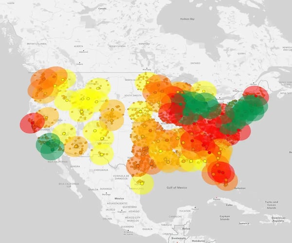
Radius maps are powerful way to use interactive mapping software that helps businesses with smarter territory planning.

The business impact

  • Territory Planning: Assign the closest reps to customers to cut travel time
  • Gap Analysis: Visualize coverage dead zones where you need new sites
  • Targeting: Isolate high-potential prospects within a specific range for hyper-local marketing
  • Logistics: Optimize routes to maximize service capacity

Types of Radius Maps


There are two ways to draw a radius on a map. One is distance-based and the other is based on driving time. Let’s take a closer look at the differences between these two types.

Radius map of New York

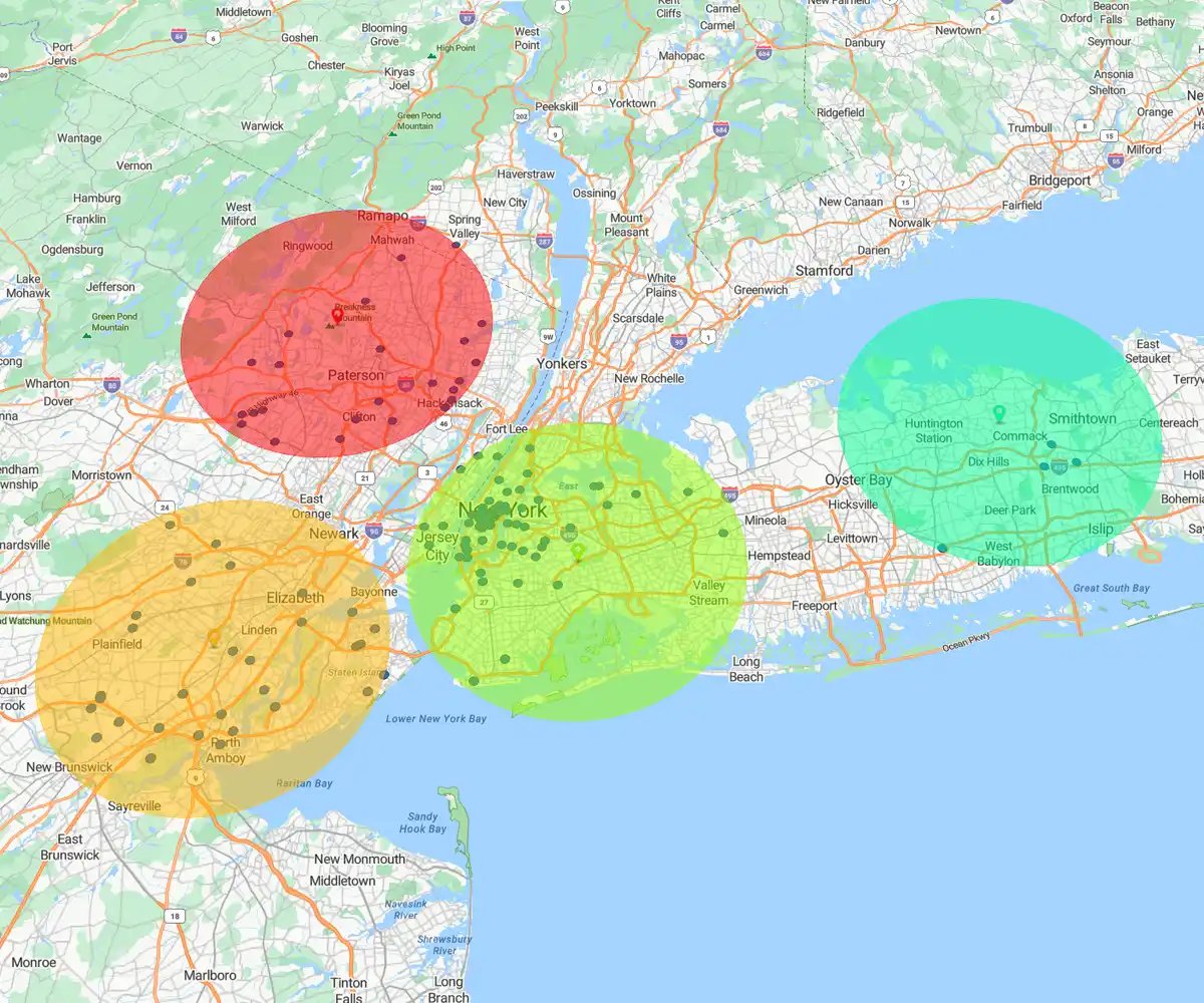
Distance-based Radius

Draws a perfect circle (e.g., 10 miles).

Best for: Broad market reach, direct mail campaigns, and measuring simple proximity.
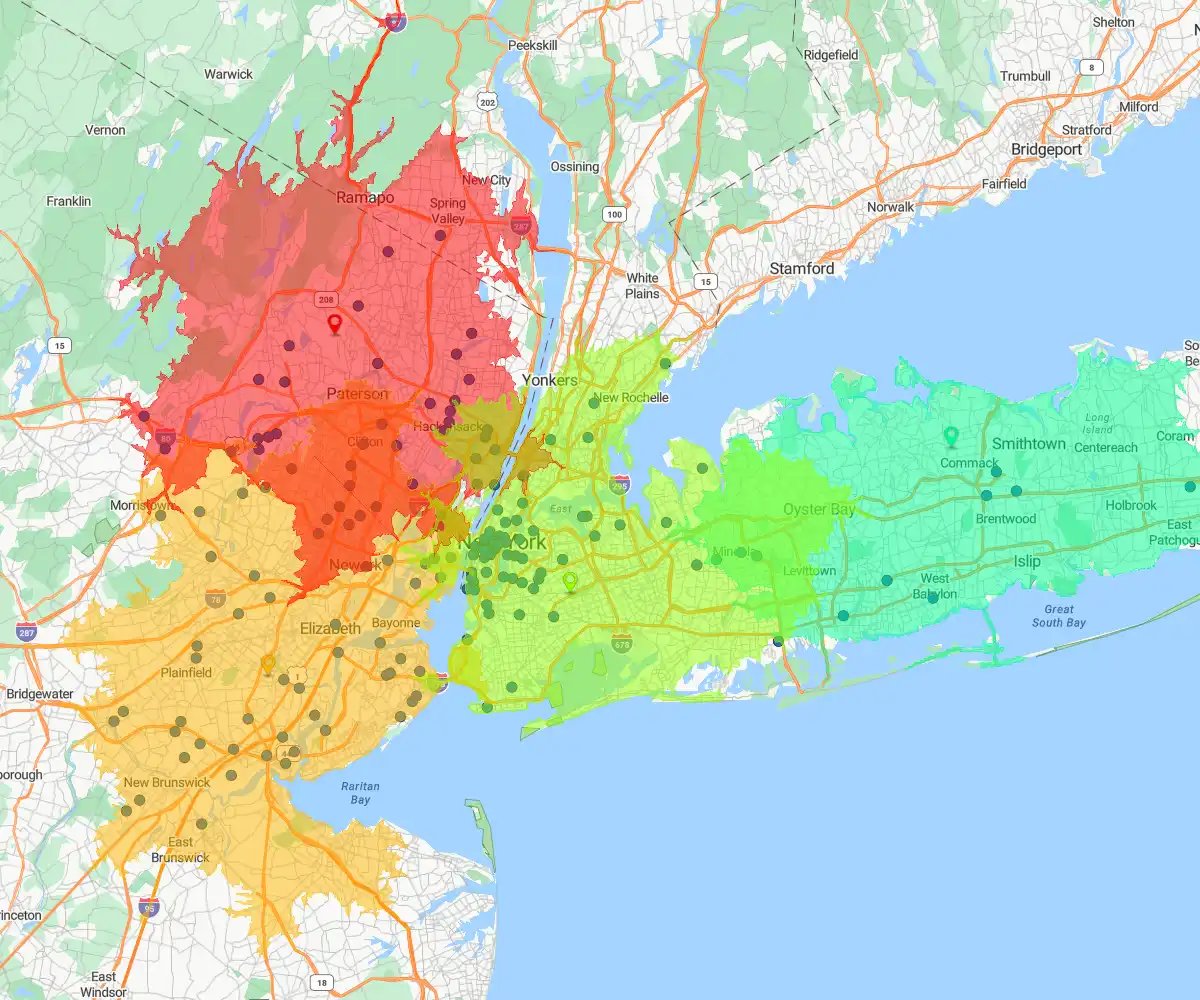
Drive time map, New York

Drive-time Radius

Draws an irregular shape based on travel time (e.g., 30 minutes).

Best for: Logistics, service calls, and sales routes where traffic and road networks determine reality.

How to Create a Radius Map:
Step-by-step Guide


Once you define your goal, the tool handles the math. The workflow: Plot buffers, set parameters, and customize your visualization in minutes.

Step 1

Step 1: Choose Your Tool

Select the radius type that matches your operational reality.

Distance-based: Best for physical assets

  • Use when: You need a fixed perimeter (e.g., 10 miles) for cell towers, billboards, or stores
  • Ideal for: Rural areas where traffic doesn't skew travel time

Drive-time: Best for people and logistics

  • Use when: Traffic dictates accessibility. Essential for sales reps, delivery drivers, and service technicians
  • Ideal for: Urban zones and planning service-level agreements (e.g., "within 30 minutes")

Step 2

Step 2: Draw the Radius

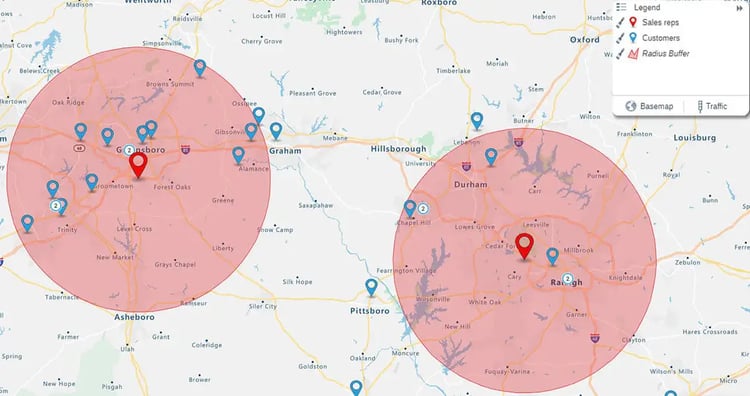
To draw a map, you need two things: a center point (e.g., a sales rep) and surrounding data points (e.g., customers).

Drawing a Circle

  1. Upload your data (e.g., reps and customers) and select Analyze
    Map control panel
  2. Select Radius
    Radius analysis map link
  3. Choose a distance (e.g., 10 miles), select your center points and surrounding points, then hit Complete
    Radius analysis map options
  4. A circle appears showing all customers within that set radius, which is perfect for proximity mapping techniques that harness the power of geography to unlock spatial insights

Drawing a Drive-Time Area

  1. Upload your data (e.g., reps and customers) and select Analyze
  2. Select Drive TimeDrive time analysis map link
  3. Enter a drive-time length (e.g., 30 minutes), then hit Complete
    Drive time analysis map options
  4. You'll see a real-world travel zone based on roads and traffic, which is ideal for planning routes and coverage realistically

Step 3

Step 3: Customize and Style

Don't settle for the default view. Tweak your map to highlight exactly what matters.

Refine your analysis

  • Edit: Click Analyze to adjust distance or toggle "Outside Results" to spot missed opportunities
  • Style: Adjust fill colors and transparency to clarify zones without hiding underlying data
  • Layer: Overlay competitor or lead data to see density patterns
  • Context: Switch basemaps—light, dark, or satellite—to match your presentation

Real-world applications

Radius maps move beyond theory to solve specific industry problems.

Use cases:

  • Real Estate: Evaluate property proximity to amenities like schools and parks
  • Emergency Services: Assess critical coverage zones for fire and police stations
  • E-commerce: Analyze delivery times from fulfillment centers to pinpoint where you need new micro-sites

Radius Maps: Daily Intelligence


Radius maps are not one-off reports. They integrate directly into the daily workflow across your organization.

The daily impact

  • Sales Managers: Design balanced territories and spot underserved areas for instant growth
  • Marketers: Target campaigns with precision based on customer proximity and range
  • Operations Teams: Plan site visits and deliveries efficiently to maximize time and cut fuel costs

Learn more about eSpatial pricing plans and let us help.

Frequently Asked Questions


How Does a Radius Map Fix Unbalanced Territories?

Territories look fair in a spreadsheet but are often impractical in reality. A radius map instantly visualizes the actual ground a rep can cover, factoring in customer density and drive-time.

The solution

  • Action: Draw a drive-time radius (e.g., 30 minutes) from a rep's home base
  • Adjust: Instantly see accessible accounts and adjust boundaries for genuinely balanced workload
  • Impact: Reduce windshield time and increase selling time

How Do I Target a Precise Radius Marketing Campaign?

Draw a distance-based radius, then select and export only the contacts that fall within your exact campaign area. Stop guessing with blunt instruments like targeting entire counties. Your marketing budget demands surgical precision.

The process

  • Draw: Instantly create the 15-mile circle around your new location
  • Select: See every prospect inside that perimeter and export the list
  • Integrate: Push the high-potential audience directly to your marketing automation platform

How Do I Test New Service Center Locations Based on Drive Time?

Poor site selection is a costly mistake. Use visual evidence—not guessing—to de-risk the entire decision. Plot your top 20 VIP accounts and model a 45-minute drive-time radius from each potential site.

The process

  • Action: Plot your VIP accounts, then drop a pin for a potential service center address
  • Test: Generate the 45-minute drive-time zone instantly
  • Verify: See how many of the 20 critical accounts fall inside the zone to confirm required coverage

Why is Drive-time Better Than a Simple Circle?

A drive-time map uses real-world road networks and traffic data to show you the realistic picture of a rep's travel range. The simple circle is often misleading. A 10-mile radius in a dense city could take an hour to cross, while the same distance in a rural area might take 10 minutes.

The payoff

  • Efficiency: Drive-time analysis accounts for this discrepancy instantly
  • Optimize: Build smarter, more efficient territories based on time, not just distance
  • Productivity: Equip your reps with routes they can actually manage

Is This Tool Too Technical for Sales and Marketing?

If your team can use a spreadsheet, they can create a powerful radius map in seconds. We designed this for business users, not data scientists. Intuitive tools empower your team; complex tools require IT support.

The process

  • Set center: Click a location on the map
  • Define radius: Type in the distance or drive-time (e.g., 25 miles or 30 minutes)
  • Result: The map generates instantly, with no complex setup required

How is a Radius Map Fundamentally Better Than Pivot Tables?

Excel answers "how much"; a radius map answers the critical question of "where?". Spreadsheet rows hide reality. A map instantly transforms your static data into visual proximity insights that are impossible to see in a table.

The impact

  • Risk Mitigation: Immediately exposes customers at risk (e.g., more than 60 minutes away from service)
  • Action Plan: Turns static data into a clear plan for improving efficiency and customer service

How Does Your Radius Tool Go Beyond Mapping Dots?

The radius tool enables directspatial analysis, moving beyond passive visualization.

Why it matters: Seeing dots is passive. The ability to instantly calculate sales potential or count prospects within a specific geographic area transforms the map into an active decision-making tool.

The impact

  • Example: Draw a 20-minute drive-time zone around a sales rep and see that it contains $5M in untapped potential
  • Outcome: Provides the key metrics for optimizing territory design and targeted marketing campaigns

How Do I Build an ROI Case for a Radius Map?

Use the map to generate "visual evidence" of inefficiency that executives cannot ignore. Stop relying on assumptions. You need to show leadership the immediate cost of poor design.

The business case

  • The "Aha" Moment: Map shows top reps spending hours driving past underserved, high-potential accounts
  • The Fix: Rebalancing territories based on this insight
  • The ROI: Clients see a significant increase in revenue (up to 7%) by ensuring reps spend more time with the right customers

Learn More About How You Can Leverage
eSpatial as a Radius Map Tool

You appear to be offline at the moment, this notice will disappear once your device can connect to the internet again