

In this guide, you'll learn how to:
- Build a strong, balanced sales territory plan from scratch
- Use data to make smarter hiring and resource decisions
- Align the right reps to the right accounts or regions
- Tap into tools (and a free template) to simplify planning
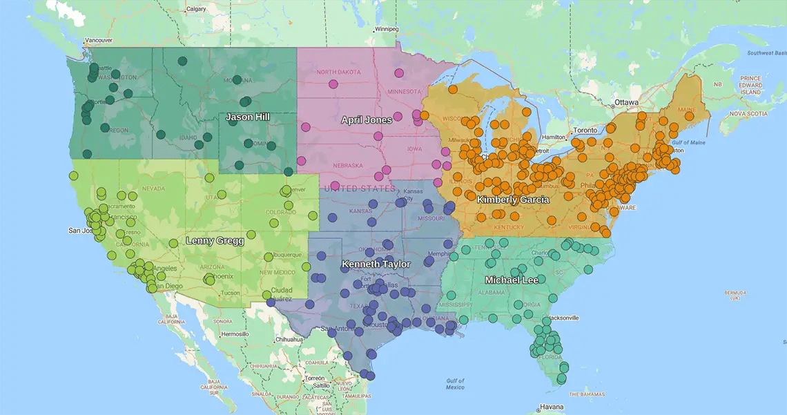
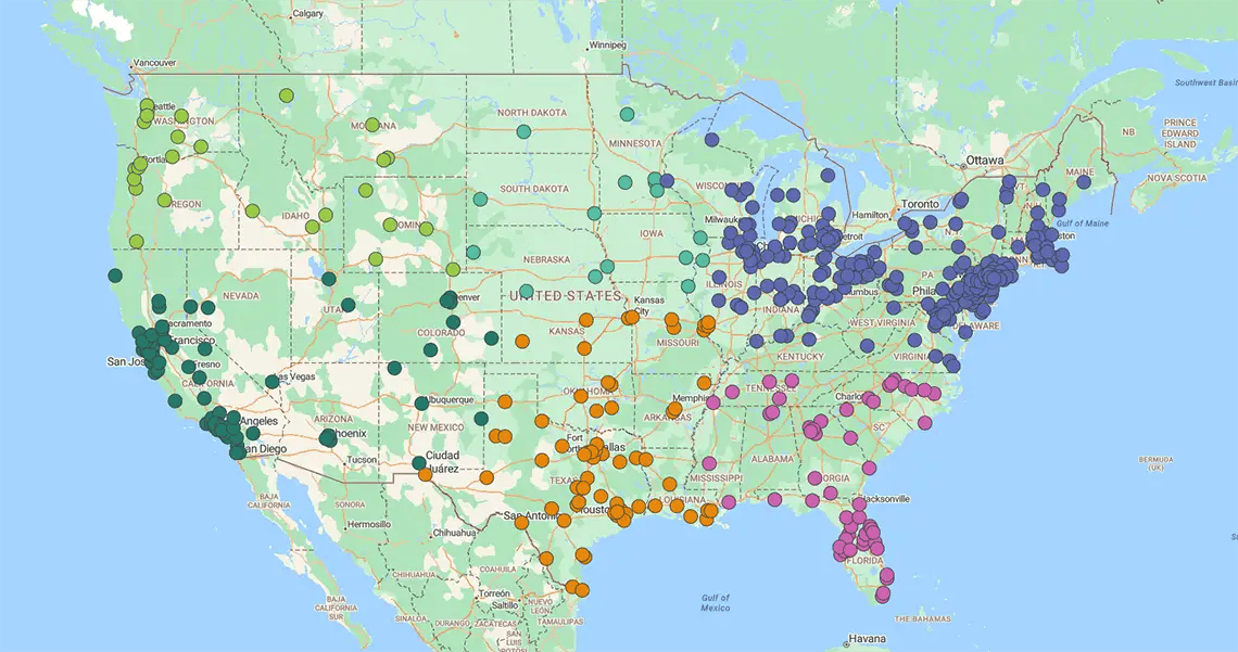
Geographic Sales Territory
You assign reps to specific boundaries—ZIPs, counties, or states.
It minimizes "windshield time" (wasted travel) and maximizes face-to-face selling.
The payoff
- Efficiency: Reps spend less time driving and more time closing
- Local intel: Your team masters local buying nuances and cultural trends
- Simplicity: It is the easiest model to deploy and manage
Best for: Businesses prioritizing proximity and high-frequency field visits.
Account-based Sales Territory
You ignore the map. Reps are assigned to specific clients based on relationships or expertise, not zip codes.
Your highest-value clients need your best people. This model prioritizes revenue potential over travel time.
The impact
- Deep relationships: Senior reps focus entirely on retention and upselling key accounts
- Expert matching: You align your best closers with your biggest opportunities, regardless of location
- White-glove service: Top clients get specialized attention, locking in long-term loyalty
Best for: Enterprise sales, complex verticals, and high-value account management.
Hybrid Sales Territories
It blends geographic borders with account-based focus. You assign some reps to regions and others to specific high-value lists.
You don't have to choose between efficiency and relationships. You get the best of both worlds.
The impact
- Balance: You match rep strengths to business needs—hunters take territories, farmers take key accounts
- Coverage: You capitalize on local expertise while ensuring your VIP clients get white-glove treatment
- Adaptability: It creates a resilient structure for complex sales environments where "one size fits all" fail
Use this 4-step blueprint to avoid missed opportunities and deploy reps perfectly.
A structured process ensures you cover every base. You move from "hoping for growth" to engineering it through effective sales territory design.
The roadmap
- Analyze: Assess the market landscape
- Segment: Group your customers by value
- Evaluate: Run a SWOT analysis to spot gaps
- Build: Create the final territory map
Step 1
Analyze Your Market
Don't draw a single line until you have the data. Successful plans start with a deep dive into market reality.

Data reveals the patterns you can't see with the naked eye. It turns "gut feeling" into a targeted strategy.
What to track
- Buying trends: How and when customers purchase
- Performance history: Where you hit (or missed) targets in the past
- Competitor intel: Where the competition is entrenched and where they are weak
The result: You tailor your map to actual market needs, ensuring you attack the highest-potential areas first.
Step 2
Segment Your Customers
Not all accounts are equal. Group your customers by location, value, behavior, and industry to prioritize your best targets.
Markets move fast. You need the flexibility to quickly rebalance customer groups and realign territories.
Rigid plans fail. A segmented, flexible approach ensures your strategy delivers results, no matter how the landscape shifts.
Step 3
Conduct a Swot Analysis
Don't fly blind. Evaluate your internal strengths and weaknesses against external opportunities and threats.
This is the reality check for your plan. It ensures you aren't setting reps up to fail by ignoring market hazards or internal skill gaps.
The impact
- Precision matching: You stop guessing and start assigning the right rep to the right account
- Talent alignment: You deploy your heavy hitters to high-value targets and support reps to developing areas based on facts, not favor
Step 4
Build the Sales Territory Plan
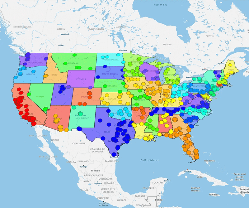
This is where strategy meets execution. Combine your data, research, and goals into a single, living map.
How to do it: Use territory software (like eSpatial) to ingest live data from Salesforce, CRMs, or spreadsheets.
Visuals to leverage:
- Heat maps: Visualize customer density and hot spots. Learn more
- Pin maps: Locate specific accounts and prospects. Learn more
- Radius maps: Define coverage areas and travel limits. Learn more
- Route maps: Optimize daily travel for maximum efficiency. Learn more
Once your software is set and your data is clean, the results follow. A well-aligned territory plan isn't just about organizatio, it's about hitting your number.
Optimized territories create a scalable engine for growth. Here are the critical outcomes you can expect when you get the map right.
Outcome 1
Decide With Data
You stop guessing. Effective planning turns raw numbers into visual insights, eliminating the "gut feeling" from strategy. A data-led plan isn't a static PDF. It is a living solution that slashes planning cycles and makes realignments painless.
The upside
- >Visual clarity: You see the truth immediately, ending internal debates
- Instant alignment: Share live maps to collaborate with stakeholders in real-time
- Speed: You streamline realignments, reacting to market changes in days, not months
Outcome 2
Improved Sales Performance
A mapped pipeline is a healthy pipeline. You track leads, opportunities, and wins geographically, spotting cracks in your coverage instantly. Data from Gartner, confirms that optimizing territories doesn't just organize the team—it increases sales by streamlining planning and execution.
The upside
- Full visibility: See deals lost and won on a map to understand regional trends
- Proactive coaching: Spot struggling reps early based on territory data, not end-of-quarter panic
- Revenue lift: You align effort with opportunity, ensuring your best reps are working your best patches
Outcome 3
Reduced Sales Costs
Field sales is expensive. Salesforce reports that sales reps spend just 28% of their time selling, with the rest on admin tasks.
Every minute spent planning a route is a minute not spent closing a deal.
The fix
- Optimize routes: Automated mapping eliminates manual planning time instantly
- Kill windshield time: Reduce drive time to squeeze in more meetings per day
- Boost face time: Shift the balance from "logistics" back to "selling"

Outcome 4
Sustainable Business Growth
Over time, your customer distribution changes due to shifting market demand, increased competition, or other outside influences (economic, social). With a complete view of your territories, you can predict these market fluctuations and adjust your sales strategies. Moreover, territory mapping tools can help you leverage scenario planning, allowing you to identify expansion opportunities and grow your customer base.
Outcome 5
Better Hiring Decisions
Knowing how to create a sales territory plan helps you match the right reps to the right opportunities—a crucial driver of your business's success. While the average sales rep tenure continues to decline according to The Bridge Group's 2018 report, but balanced workloads can support morale and reduce attrition. Finally, having a clear sales territory plan example accelerates onboarding and boosts early rep performance.