|
The Insights Struggle |
The eSpatial Advantage |
|---|---|
|
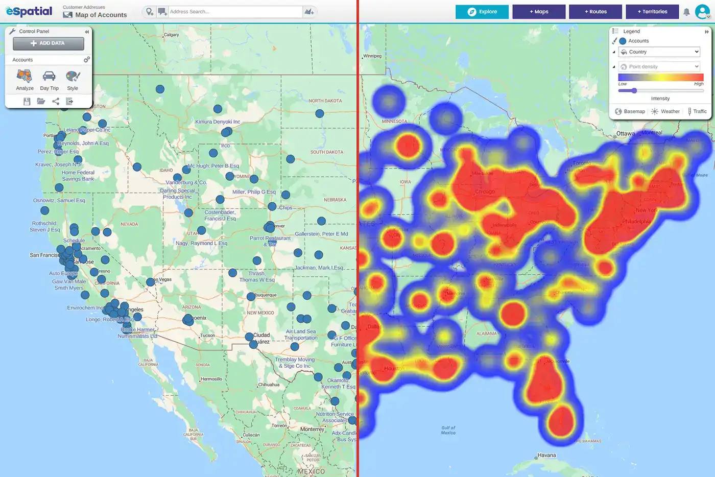
Linear BI: Staring at rows makes it impossible to see geographic overlaps or "white space" gaps. |
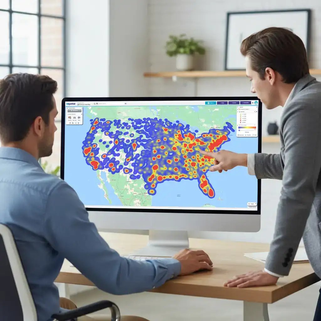
Geospatial Visualization: Patterns, clusters, and underserved markets become instantly visible via data visualization maps. |
|
Static Reporting: Hours spent cleaning data and manual "pin-dropping" in generic BI tools. |
Automated Insights: Upload .csv or sync Salesforce to generate an online mapping and visualization report in seconds, see how easy it is to get started with eSpatial. |
|
Subjective Decisions: "I think we have enough coverage in the Southeast". |
Objective ROI: "The geo visualization proves our 10-mile proximity rule covers 85% of target revenue". |
Visual Intelligence: Transforming
Big Data into Market Strategy

1. Complex Data Visualization
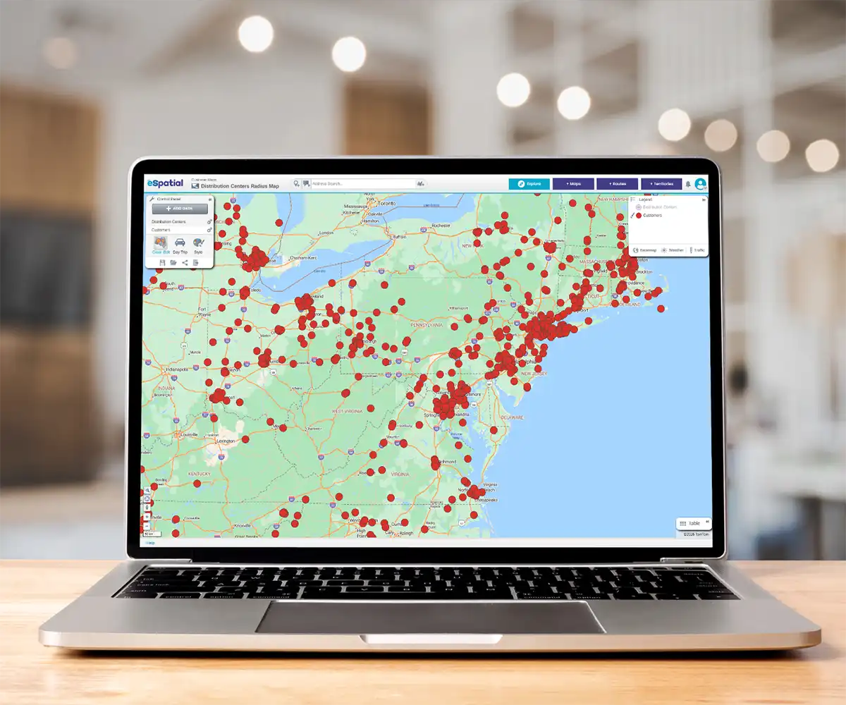
Standard business data visualization tools often crash or freeze when processing large datasets. eSpatial is engineered for enterprise-level scale, seamlessly handling millions of data points across your organization. Unlike standard mapping tools, it gives you the power to map up to 300,000 records on a single map without experiencing any lag.
2. Heat Map & Bubble Map Analysis
Identify your "Whales" using specialized types of map visualizations.
- Heat Maps: Ideal for geo visualization of market density or service gaps
- Bubble Maps: Scale pins by revenue or volume to highlight high-value targets geographically

3. Professional Visual Reporting with Maps
Go beyond the dashboard. Generate a visual report designed for boardrooms. Our spatial reporting tools allow you to customize branding, color palettes, and boundary labels, ensuring your geospatial visualization aligns with your corporate identity.
Industry Spotlight: Visualizing
Performance at Scale

Stop guessing where your next clinic belongs. Most healthcare leaders rely on spreadsheets that hide the truth about patient access . eSpatial turns that data into a clear story, allowing you to validate that 70% of employees are within a 10-mile radius of your care.
Whether you are identifying service gaps or presenting a winning Request for Proposal (RFP), we give you the visual proof needed to expand with confidence and close more business.

Turn days of reporting into 20 minutes of high-impact visualization. In the engineering and HVAC space, performance visibility is the difference between a market leader and a laggard.
eSpatial allows regional managers to see the performance of hundreds of offices at a glance, cutting annual reporting time by an entire month.
Whether you are identifying coverage gaps or presenting complex market trends to the president, our tools make your data "come alive," ensuring you spend less time in the office and more time on business strategy.

No more board presentations with spreadsheets. Start sparking real strategy. Community banks use eSpatial to transform dense financial data into visual insights that actually drive profitability.
By layering branch locations with demographic and customer analytics, leaders have created strategic maps to identify new branch opportunities and areas for consolidation.
It is time to ditch "dated" mapping for a fresh, professional output that wows executive management and turns numbers into actionable growth.

Unlock your next $1,000,000 in growth. When your safety or specialist teams double in size, legacy alignment tools just cannot keep up. Our clients use eSpatial to finalize sales territories right in front of stakeholders, cutting project delivery times from a year down to just four months.
This clarity allows you to unlock an additional 10% in sales potential and ensure your high-value reps are not wasting their day behind a windshield.

Build a service network that actually follows your fleet. In the automotive world, "close enough" is not good enough for your customers. Leaders use eSpatial to visualize every garage and driver location, allowing them to shift from expensive Original Equipment Manufacturer (OEM) repairs to high-quality local independents.
By seeing the "hidden map" of your network, you can increase local network usage to 70% and cut route planning time from 10 minutes to mere seconds.

Quit leaving money on the table at the job site. Your equipment is only valuable when it is in the right place at the right time. Our customers use eSpatial to bridge the gap between "gut feeling" and actual construction data, identifying $100,000’s in potential shipping savings by finding the most cost-effective plants.
Use these maps to challenge dealer perceptions, find gaps in your national coverage, and proactively target upcoming projects before the competition even knows they exist.
Mapping Software Solutions
-
 Market Analysis & Trends
Find your white space. Use heat maps and spatial analysis to spot regional gaps, untapped potential, and de-risk expansion.
-
 Strategic Location Decisions
Align physical assets with demand. Map workforce locations securely, optimize site selection, and mitigate risk with proximity analysis.
-
 Sales Productivity
Give reps back 5 hours a week. Natively map your CRM data to visually cluster high-value accounts and analyze your sales pipeline.