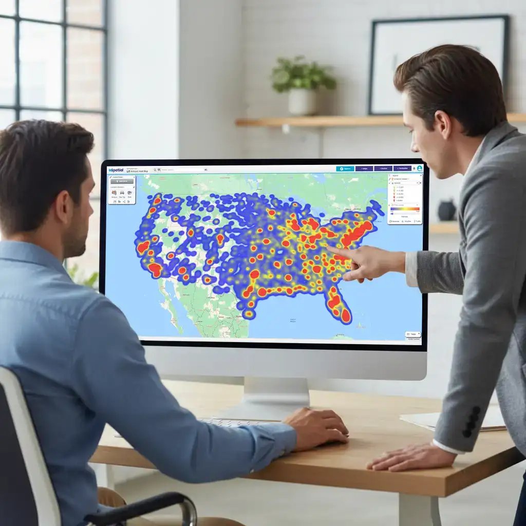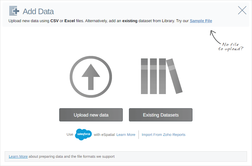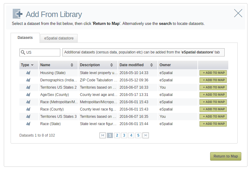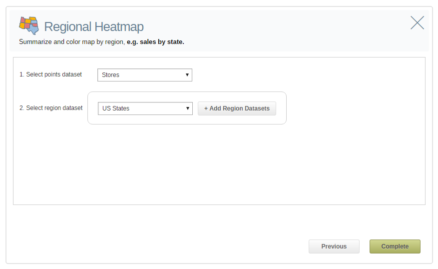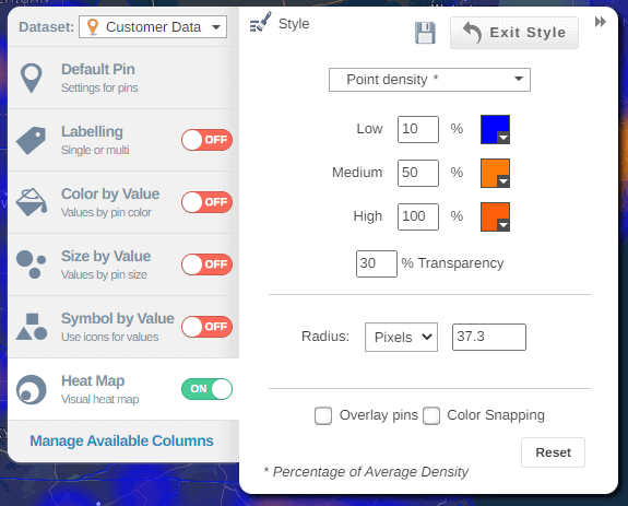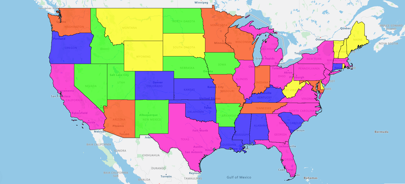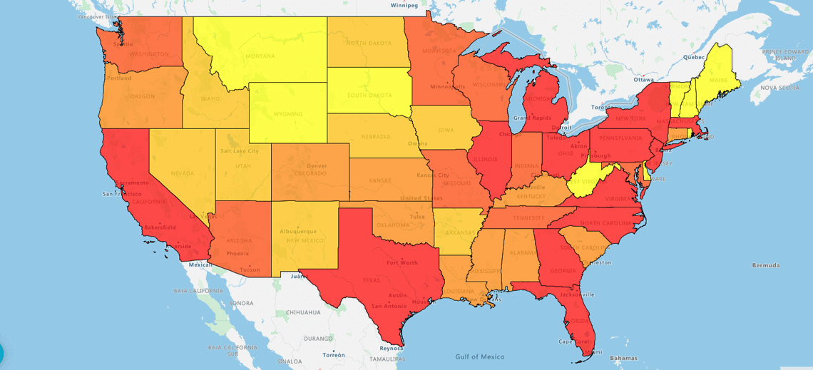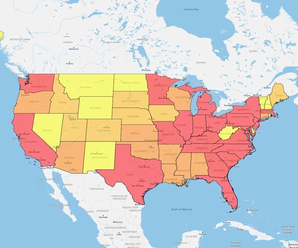
A heat map is a color-coded geographical representation of your data, highlighting the data's density.
So, for example if I wanted to see where my leads were, the concentrations of leads using a hotspot heatmap. It's a bit like a weather map. I can see where the red areas are the highest concentrations.
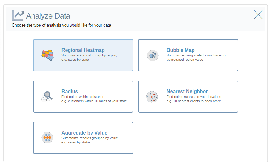
Or with a Regional heatmap, by state. The darker states, the darker colored states show the highest density. And the lower densities in red.