

• Data visualization

How Does Cluster Mapping Optimize Field Operations and Territories?

Liam Costello
  • Published: January 17, 2024
  • Updated: August 27, 2026
  • Author: Liam Costello
  • Reading time: 10 mins

Quick answer

Scaling field organizations hit a hard operational wall when managing route efficiency, SLA compliance, and territory coverage across expanding regions. Relying on large datasets in spreadsheets hides spatial patterns, forcing team leaders into sub-optimal decision making instead of strategic planning. Dynamic location intelligence replaces static rows with visual clarity, turning complex address data into actionable territory decisions.

What is Cluster Mapping
in Field Operations?


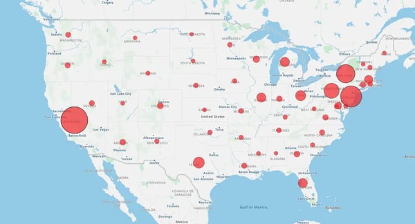
Cluster mapping—commonly referred to as bubble mapping or density mapping, uses proportional symbols and visual heat gradients to display customer, work order, and asset concentration across geographic regions. Field service managers use these mapping features to eliminate travel bottlenecks, optimize daily routes, balance technician workloads, and maintain SLA compliance.

How Do Proportional Symbols and Density Maps Visualize Account Volume?


While industry search terms frequently use "cluster mapping," software platforms execute this visual analysis through three primary map types depending on your operational goals:

Bubble Maps

Group nearby data points into circular symbols that scale dynamically based on underlying metrics. Larger bubbles instantly highlight dense account hubs or high-volume work order zones requiring dedicated technician coverage.

Density Maps & Heat Maps

Display regional concentration using color gradients rather than distinct icons. Hotspots pinpoint high-frequency service zones by ZIP code or county, showing exactly where field workloads are heaviest.

Pin Maps

Plot individual address records as distinct markers, allowing dispatchers to inspect specific location coordinates alongside high-level density views.

Spreadsheets flatten critical geographic context, making high-volume service zones look identical to scattered rural calls. By deploying bubble and density maps, field operations leaders replace static rows with immediate visual clarity. A single glance exposes where account concentrations form, where technician coverage lags, and where travel corridors cause unnecessary fleet delays.
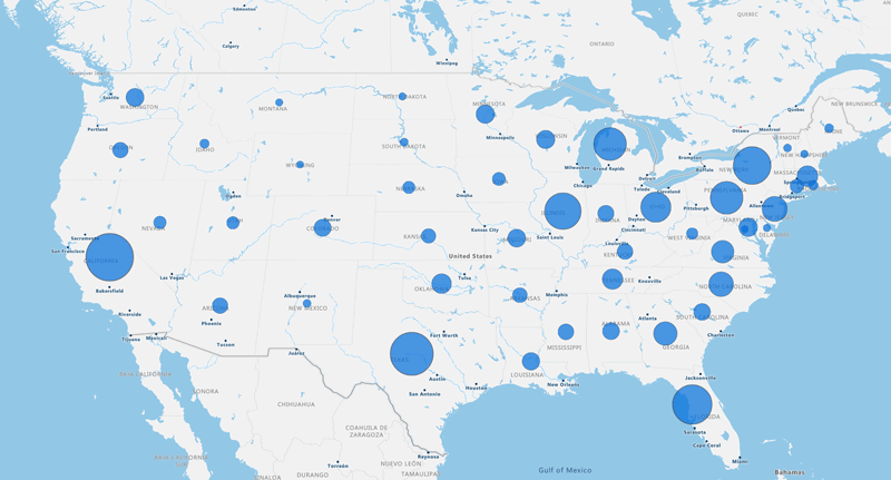
Bubble map

Low concentration

High concentration

How Does Cluster Mapping Eliminate Field Operational Inefficiencies?


Cluster mapping eliminates operational bottlenecks by converting raw spreadsheet rows into dynamic visual heat maps and bubble clusters. Field service managers leverage this location intelligence to reduce fleet drivetime by up to 30%, increase completed daily field calls by up to 20%, and balance technician workloads across territories.

  1. Visualize hidden account density: Spreadsheets conceal geographic relationships. Density and bubble maps instantly expose dense customer clusters alongside isolated remote accounts, ensuring dispatchers deploy resources where demand actually concentrates.
  2. Segment accounts by location and traits: Group field accounts by geographic proximity and shared operational needs. Operations teams use these natural regional groupings to assign specialized field technicians and tailor service level agreements (SLAs). Territory legend view
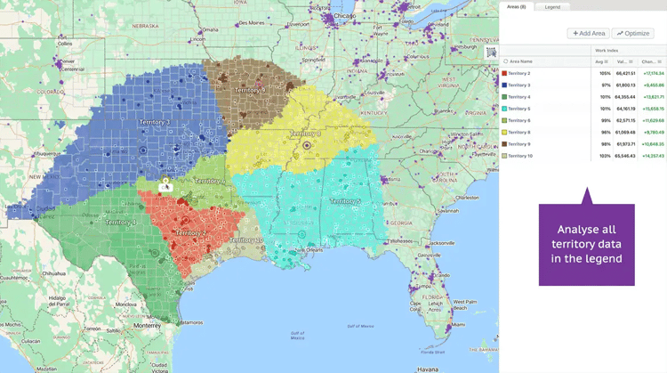
  3. Spot coverage gaps immediately: Uncover underserved zones where high customer volume forms but service coverage lags. When density maps display heat without assigned technicians, managers can quickly reallocate field staff to fill the gap.
  4. Balance workloads fairly: Square mileage is a misleading metric for territory design. Mapping account concentration allows team leaders to equalize work order volume across field staff, preventing technician burnout and reducing overtime costs.
  5. Decode regional service needs: Operational requirements vary across geographic borders. Spatial visual tools help managers distinguish urban service needs from rural travel constraints, allowing teams to adjust route schedules and parts inventory accordingly.
  6. Pinpoint expansion opportunities: High-density demand outside your current service boundaries signals high-value growth zones. Seeing these clusters on a map provides data-backed justification for opening new regional hubs or hiring local technicians.
  7. Make data-backed operational decisions: Layer spatial data over complex performance metrics to turn raw data into clear priorities. Operations directors can evaluate technician output, travel efficiency, and market density in seconds rather than hours.

How Do You Build a Cluster Map in 6 Steps?


Building a cluster map involves six steps: centralizing location data, defining operational goals, applying automated density grouping, customizing visual symbol sizes, aligning field territories, and synchronizing boundaries with CRM systems for real-time dispatch and iteration.

The 6-Step Operational Workflow

1
Step 1

Gather and Clean Location Data

Centralize address records, work order logs, and facility locations into a clean spreadsheet. Standardize City, State, and ZIP code fields to eliminate geocoding errors across your service regions.

2
Step 2

Define Your Operational Goal

Establish clear objectives before rendering visual layers. Determine whether you are balancing technician workloads, identifying coverage gaps, or optimizing fleet travel corridors.

3
Step 3

Leverage Smart Automated Grouping

Modern mapping software automatically calculates account density in the background. This instantly groups nearby accounts into visual clusters without requiring data science expertise, complex formulas, or manual work.

4
Step 4

Build and Customize The Map

Upload your dataset and select a bubble or heat density view. Adjust symbol sizes, color scale gradients, and labels so account concentrations become instantly scannable for dispatchers.

5
Step 5

Assign and Sync Territories

Draw balanced territory boundaries around visual clusters using ZIP codes or county lines.

6
Step 6

Analyze and Iterate

Review the visual map to identify geographic outliers, route bottlenecks, and shifting demand patterns. Use interactive filtering tools to refine territory boundaries as field conditions evolve.

Build Your First Density Map


Where Does Cluster Mapping Drive Measurable ROI Across Industries?


Cluster mapping delivers measurable ROI by aligning workforce resources with account density across industries. Healthcare providers reduce transit times, retail chains select target expansion locations, B2B teams align account managers with client clusters, and field teams cut dispatch costs.

Real-World Impact Across Key Sectors

  • Retail & Franchises: Visualize high-spending customer hubs and lookalike demographic groups. Retail managers use density mapping to choose high-performing store locations and target local marketing budgets without wasting ad spen.d
  • Healthcare & Home Health: Map patient addresses alongside visit frequency to streamline caregiver schedules. Healthcare operators optimize daily travel routes, reduce appointment delays, and improve patient care compliance.
  • B2B & Field Sales: Align sales representative coverage directly with account volume. Sales leaders ensure high-value client clusters receive dedicated personal visits while cutting travel expenses.
  • Telecom & Infrastructure: Plot service complaint clusters and network outages on visual maps. Engineering teams prioritize high-density outage zones to dispatch repair crews faster and protect customer retention.
  • Facilities & Commercial Maintenance: Group routine maintenance work orders by physical location. Operations directors eliminate back-and-forth travel across town, ensuring technicians complete more service calls per day.


Frequently Asked Questions


Cluster mapping answers key questions about field operational efficiency, CRM integration, and route optimization. Below are direct answers to common questions from field operations managers.

Spreadsheets display location data in static text rows, hiding spatial proximity and account density. Cluster mapping converts address rows into visual bubbles and heat maps, allowing managers to instantly identify high-volume service hubs, reduce travel time, and balance workloads across field staff.

While cluster mapping provides visual insights for datasets of any size, field teams managing 15 or more accounts, facilities, or technicians see immediate operational efficiency gains. At this threshold, manual dispatching and spreadsheet routing become inefficient, making automated density grouping essential.

Yes. Advanced mapping platforms like eSpatial feature two-way CRM integration with systems such as Salesforce. Territory revisions, account reassignments, and updated cluster boundaries sync automatically without exporting CSV files.

By grouping service calls by geographic density, dispatchers create compact travel zones for field technicians. Reducing fleet drivetime by up to 30% allows technicians to complete up to 20% more daily service calls, minimizing late arrivals and preventing SLA penalties.

Yes. Mapping platforms ingest address data directly from standard CRM, ERP, and database structures via direct file imports.

You appear to be offline at the moment, this notice will disappear once your device can connect to the internet again