

Quick answer
What Is a Bubble Map?
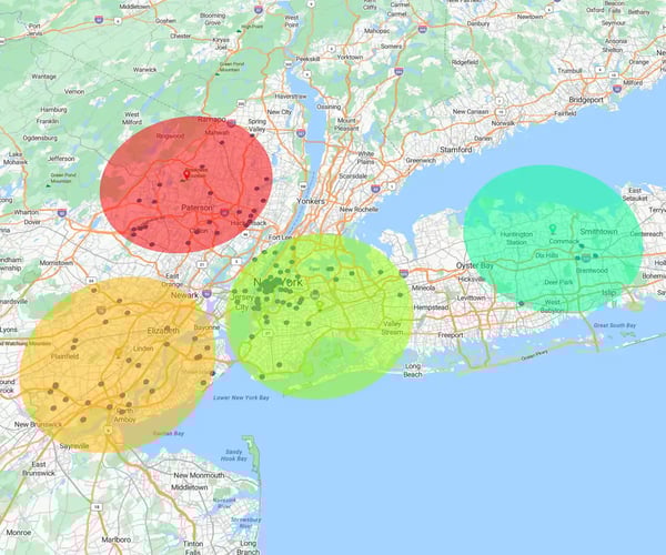
A bubble map is a spatial visualization technique that plots proportional circles over geographic coordinates or street addresses.
By scaling circle dimensions to represent metric size, such as total revenue or account concentration, it provides revenue operations teams with an immediate, three-dimensional view of regional performance.
When sales and operations teams review performance data, looking at raw location points only tells half the story. Overlaying proportional bubbles (the size representing the magnitude of your metric) onto a map reveals instant geographical patterns, turning crowded address spreadsheets into actionable territory insights.
- For Sales & RevOps Leaders: Pinpoint high-value account clusters and regional growth opportunities to rebalance sales territories without tedious manual analysis
- For Marketing Operations: Map lead density against campaign spend to identify untapped geographic markets and optimize budget allocation
- For Operations Managers: Track warehouse inventory volume, shipment bottlenecks, and customer proximity in a single visual view
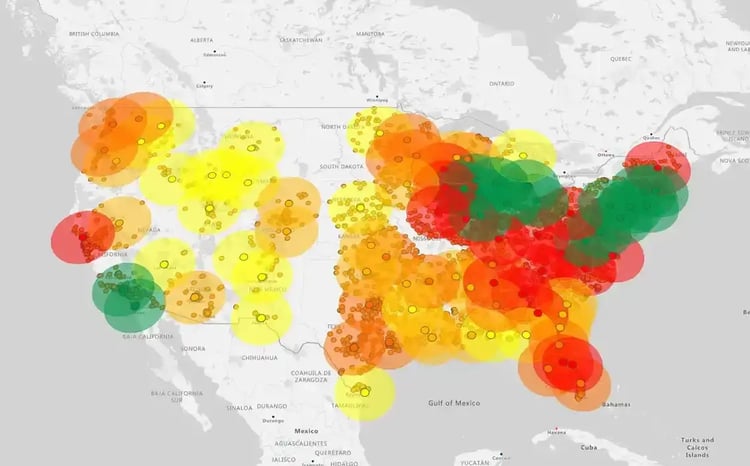
A bubble map uses sized circles on a real map to show business metrics like sales revenue by location. Scatter plots compare numbers on a basic grid without geographic context, while heat maps show overall activity concentration rather than specific account values.
Choosing the right chart prevents confusing your team or executive leadership. While scatter plots compare two sets of numbers and heat maps highlight general hotspots, bubble maps connect exact locations with actual business values like account size or deal value.
|
Visualization Type |
What It Measures |
Location Component |
Best Business Use Case |
Main Limitation |
|---|---|---|---|---|
|
Bubble Map |
Location + Metric Size + Category |
Real Map (Addresses, ZIPs, Cities) |
Sales territory performance, regional sales volume, customer clusters |
Dense areas can overlap without zoom controls |
|
Scatter Plot |
Two Numbers (X and Y variables) |
Basic Grid (No Map) |
Comparing numeric trends (e.g., price vs. sales volume) |
Lacks map context and geographic tracking |
|
Heat Map |
Overall Hotspots / Density |
Real Map |
Finding general activity areas or web traffic hotspots |
Cannot show specific numbers for individual locations |
Revenue operations teams use bubble maps to combine location, revenue, and deal size into a single visual view. This helps RevOps leaders quickly spot territory imbalances, identify high-value account clusters, and make faster, data-driven decisions without digging through dense spreadsheets.
How Do Bubble Maps Help Visualize Multi-Dimensional Data?
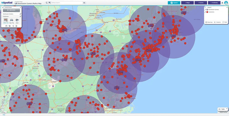
Standard spreadsheets force teams to cross-reference multiple columns to understand performance. A bubble map layers three key metrics onto one clear map: location, sales volume, and deal size.
By connecting circle size to total revenue, sales leaders instantly see where their biggest deals live without building complex pivot tables. That means faster decisions.
How Do Spatial Maps Accelerate Decision-Making and Spot Outliers?
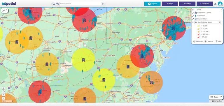
Spotting a high-value account cluster or an underserved market takes seconds on a visual map. Seeing large bubbles in an overlooked zip code tells you where to deploy reps immediately.
This visual clarity helps teams spot territory imbalances instantly, so you can reassign reps and capture revenue faster.

How Do Visual Maps Drive Alignment Across RevOps and Executive Teams?
Executive meetings run far smoother when everyone looks at the same visual map instead of endless spreadsheet rows. Maps connect people because they are intuitively easy to understand.
When sales, marketing, and finance leaders see clear geographic trends together, sign-offs happen faster and strategy aligns across every department.
To format an accurate bubble map, scale circle size by total surface area rather than radius to avoid exaggerating metrics. Use opacity controls and zoom filters to clear visual clutter in dense regions, and color-code bubbles to add category insights.
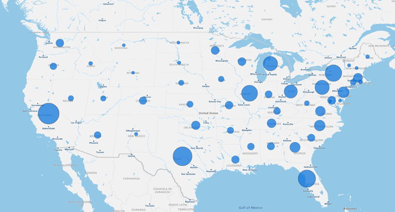
Why Does Proper Bubble Area Scaling Prevent Visual Data Distortion?
When comparing business values on a map, circle surface area must scale proportionally with your metrics. If software incorrectly scales the radius of a circle instead of its surface area, doubling a metric quadruples the visual size on screen.
This mathematical trap visually exaggerates differences between accounts, misleading leadership during business reviews. Dedicated location software automates proportional surface area scaling, ensuring visual weight always matches actual business numbers.
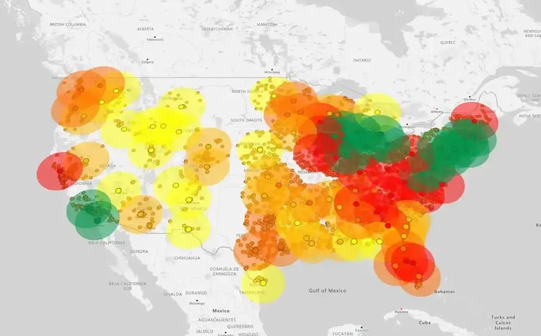
How Do You Prevent Overlap and Visual Clutter Across Dense Geographic Regions?
High-density metropolitan markets often suffer from overlapping bubbles that hide critical account details. Adjusting bubble opacity allows secondary locations to show through larger accounts, keeping every data point visible.
Using interactive zoom controls and dynamic min/max bubble sizing lets you adjust map density on the fly. This keeps dense urban clusters readable without losing regional context across larger territories.
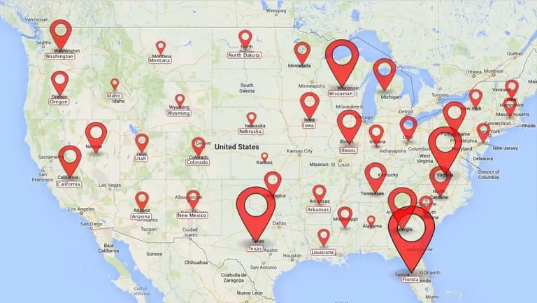
How Should You Use Color Variables and Filtering for Categorical Data?
Color-coding bubbles adds a fourth dimension of insight to your spatial map without cluttering the layout. Assigning distinct colors to account tiers, sales reps, or product lines helps you compare regional performance at a glance.
Applying dynamic filters lets you toggle specific categories on or off during live strategy sessions. Executive teams can instantly focus on high-priority accounts or specific territory segments without generating new reports.
The best tools for creating business bubble maps depend on software complexity and workflow automation needs. Dedicated mapping platforms like eSpatial offer instant Salesforce CRM integration and automated area scaling, while business intelligence tools like Power BI and Tableau require custom setup, and spreadsheets offer only basic manual options.
Why Choose eSpatial for Code-Free
Mapping and Salesforce Integration?
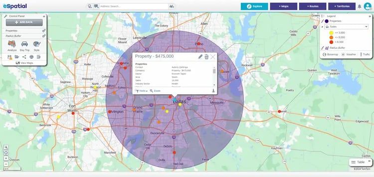
eSpatial is built specifically for business teams who need quick, precise location analysis without writing code or wrestling with GIS settings. It syncs directly with Salesforce CRM, updating bubble maps automatically as live account values, deal stages, or revenue numbers change. Because eSpatial combines bubble map analysis directly with territory design and route planning tools, your operational insights turn into immediate action.
How Do Tableau and Power BI Handle
Advanced Spatial Visualizations?
Platforms like Tableau and Power BI handle complex enterprise data models well, but creating custom bubble maps often requires technical configuration. While BI tools excel at general executive dashboards, they usually lack built-in territory management and field route optimization workflows. Business operations teams often find themselves needing extra add-ons or custom scripts just to perform basic geographic rebalancing.
What Are the Limitations of Creating
Bubble Maps in Google Sheets or Excel?
Standard spreadsheets like Google Sheets or Excel can generate simple charts, but they struggle with dynamic geographic mapping. Spreadsheets do not offer automatic address geocoding, meaning you have to manually match addresses to latitude and longitude coordinates. Spreadsheet bubble charts often default to scaling circle radius instead of surface area, which visually distorts data and leads to inaccurate decision-making.