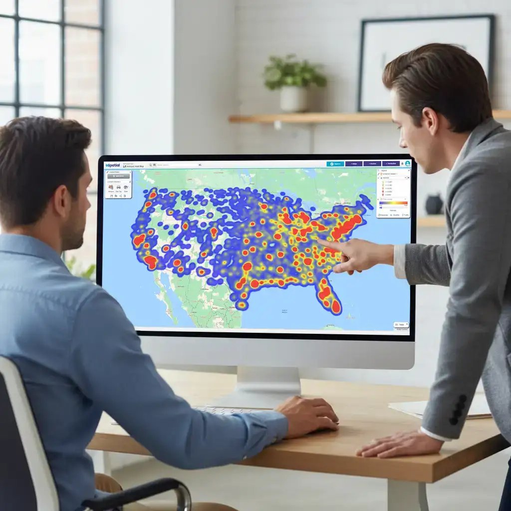
Use color ranges to illustrate data density and specific values across ZIP codes. Visual coding turns abstract spreadsheets into an instant read on performance. You can spot high-value territories or gaps at a glance.
Work smarter: Save your custom color palettes as templates. This allows you to apply consistent styling to new datasets instantly, saving hours of manual formatting. Learn how to create color-coded ZIP code maps with our quick how-to guide.
What is a Color-coded Map?
Assign unique colors to individual ZIP codes to differentiate areas instantly.
Visual distinction makes it easy to see independent territories and precise geographic limits at a glance. You stop guessing where one zone ends and another begins.
Group ZIP Codes: Visualize Status
Group multiple ZIP codes by color to represent shared values or status.
Why it matters: This creates an instant visual binary for complex data. You don't need to read the data; you just see the pattern.
Real-world example: Service Coverage
- Green: Region covered by a service team
- Red: Region not covered
Link Data to Regions
Upload Excel data and automatically link it to specific ZIP code boundaries. This layers depth onto your visual map. You see the high-level status (covered vs. not covered) by color, but access the hard data with a single click.
- Visualise status: Use color codes to see who is covered instantly
- Reveal details: Click any region to open an info box displaying the spreadsheet data attached to that boundary, such as customer counts or service engineer availability
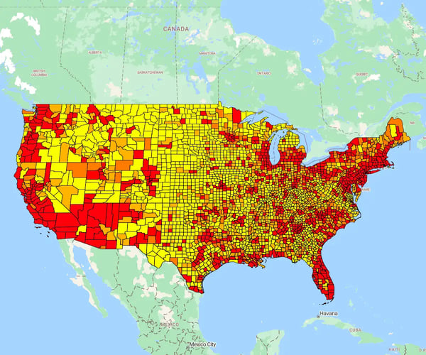
Color Code Vs. Heat Map
Choosing the right visual style determines whether your data is understood or ignored.
- Color-coded maps: Best for clear, distinct categories (e.g., "Covered" vs. "Not Covered"). Use this for binary or text-based values.
- Heat maps: Best for showing intensity or density across a range of integer values.
Real-world Example
Mapping population density:
- Dark red: High density
- Light pink: Low density
- The range: Shades in between capture the nuance of the data distribution
Layer Data on a Color-coded ZIP Code Map
A single dataset tells only half the story. Layering additional data points creates a multidimensional view of your market.
How it Works
- Reuse: Create and save your base color-coded map to use as a template for future analysis
- Overlay: Plot distinct variables—such as competitor locations—directly onto your service regions to spot threats or gaps instantly