
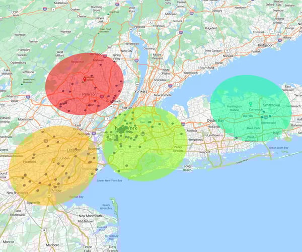
A bubble map is a type of map that summarizes data levels in a specific region. It does this by creating different-sized circles that represent the value of your information. The larger the circle (or “bubble”), the higher the value.
For example, you can create a bubble map to display your sales revenue in a specific city, where the most prominent bubble represents the highest sales.
Bubble maps are a great way to show location-based data using proportions. Sales, marketing, and operations use bubble maps to communicate complex data to other stakeholders. Bubble maps are easy to understand, making them excellent tools for presenting in-depth data in reports and presentations.
Bubble maps are perfect for data analysts, sales and marketing teams, and revenue ops:
- Sales managers: Analyze sales patterns and identify new areas for growth
- Marketing managers: Analyze customer buying patterns or densities for events or campaigns
- Operations managers: Identify customer clusters near distribution centers and refine their supply chains
At a glance, you gain new data-backed insights that can improve your decisions.
Bubble maps transform raw location-based data into strategic insights, helping you make decisions and solve problems. They can give you a competitive edge in market analysis, operational planning, and performance tracking.
1. Visualize complex data
- Bubble maps simplify complex datasets by displaying metrics in a visual way that's easy to interpret
- Geographic context helps you quickly understand trends without sifting through text-heavy spreadsheets
2. Support smarter decisions
With the information you gain from bubble map data visualization, you can make informed decisions that help you allocate resources more efficiently. For example, you can prioritize high-revenue regions or identify underperforming areas that need improvement.
3. Spot patterns and outliers
Bubble mapping for business reveals recurring patterns and highlights gaps or anomalies, such as unexpected sales growth or decline in certain areas.
4. Boost team collaboration
- Bubble maps are easy to interpret, meaning team members across multiple departments or with different levels of data expertise can engage with the information on equal footing
- When used in collaborative tools or dashboards, bubble maps allow teams to explore scenarios, share insights, and align strategies more effectively
The ideal example of a bubble map should follow a few key guidelines to ensure it's as clear and informative as possible:
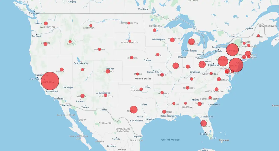
1. Scale bubbles correctly
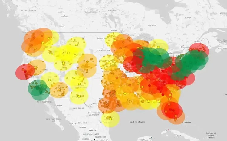
Your bubbles or circles should be sized proportionally based on area to accurately reflect values. Misleading sizes will distort viewers' interpretation of your map.
2. Reduce overlap
Overlapping bubbles make it difficult to distinguish between data points and may also hide important information. You can minimize overlap by using features like transparency or interactive zoom.
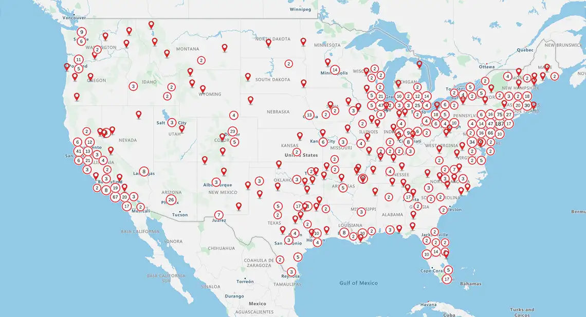
3. Add legends and labels
Legends and labels provide context by explaining what the bubble sizes, colors, or positions mean. This makes it easier for viewers to interpret the data you're presenting.
4. Use colors and filters
Color and filtering tools help guide the viewers' attention and uncover insights in complex datasets.
- You can use colors to highlight patterns, groupings, or outliers in your data
- Use filters to group your data into specific subsets
Here are some of the best bubble map visualization tools available:
1. eSpatialNo GIS Experience Required
eSpatial is a powerful mapping software designed for users with little to no geographic information system (GIS) background. The tool's intuitive interface makes mapping easy for non-technical teams. You can create a bubble map that's clear and professional without any specialized training.

2. TableauAdvanced Analytics
Tableau allows users to layer geographic data with charts, filters, and calculated fields. With powerful data exploration capabilities, it's ideal for uncovering patterns and driving insights from complex datasets — though it may require more experience or training to navigate effectively.
3. Power BIBusiness Intelligence Integration
Power BI integrates mapping directly into broader business intelligence dashboards. It allows teams to view geographic data alongside KPIs, reports, and real-time metrics, although its mapping capabilities are somewhat limited compared to dedicated tools like eSpatial.
4. Google SheetsSimple Use Cases
Google Sheets is suitable for lightweight mapping tasks, such as plotting basic location data using add-ons or integrations. Its simplicity makes it useful for quick bubble map visualizations.
5. Mapbox and other GIS platforms
Mapbox and similar GIS platforms offer advanced geographic mapping capabilities, ideal for projects requiring precision, customization, and spatial analysis.
To summarize, a bubble map makes it easy to quickly spot spatial patterns, compare data across locations, and identify outliers. It makes complex information more digestible and helps you with informed, location-based decision-making. Its interactive features improve collaboration across teams.
Are you looking to create a bubble map now that you know how it can benefit you and your business? Sign up for a free trial and learn how to make a bubble map with eSpatial today.