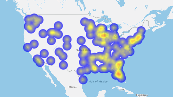
You can style the map as a visual heat or hotspot map using darker colors for low density areas and brighter colors for high density areas.
To enter the Style menu, click on the Style icon in the Control Panel.
Hotspot Heat Map
- Select the Heat Map tab turn it to the ON position
- Choose the value you want to style by from the drop down list. The default will be point density but you can also use other Integer values from your dataset.
- Set the Low, Medium and High values in the Boxes provided.
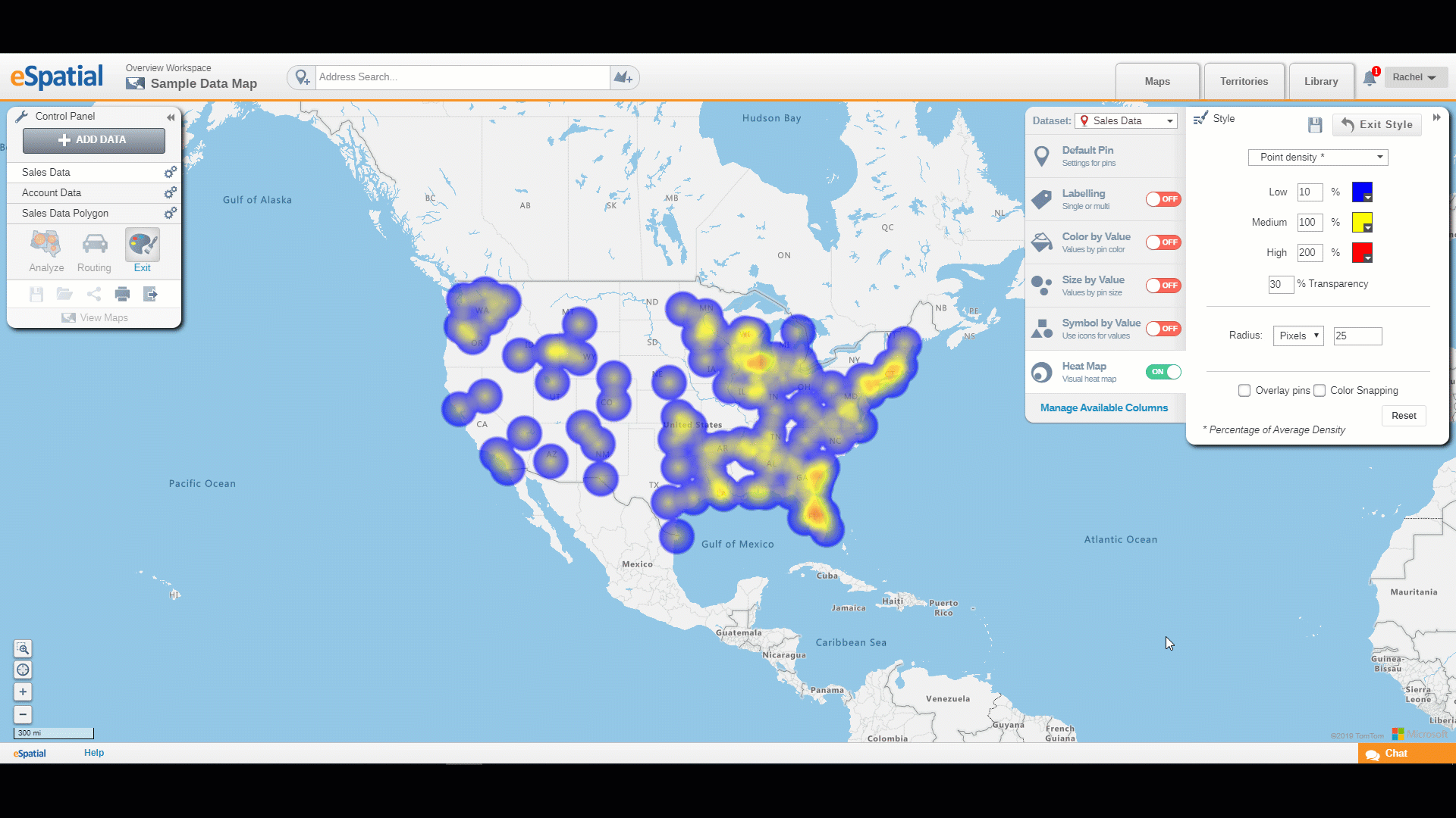
Editing Color and Transparency
- Set the range colors for the Low, Medium and High values by clicking on the Color Chooser to select the colors you want.
- Set the Transparency level. Enter the value you want or use the slider bar to adjust the transparency.
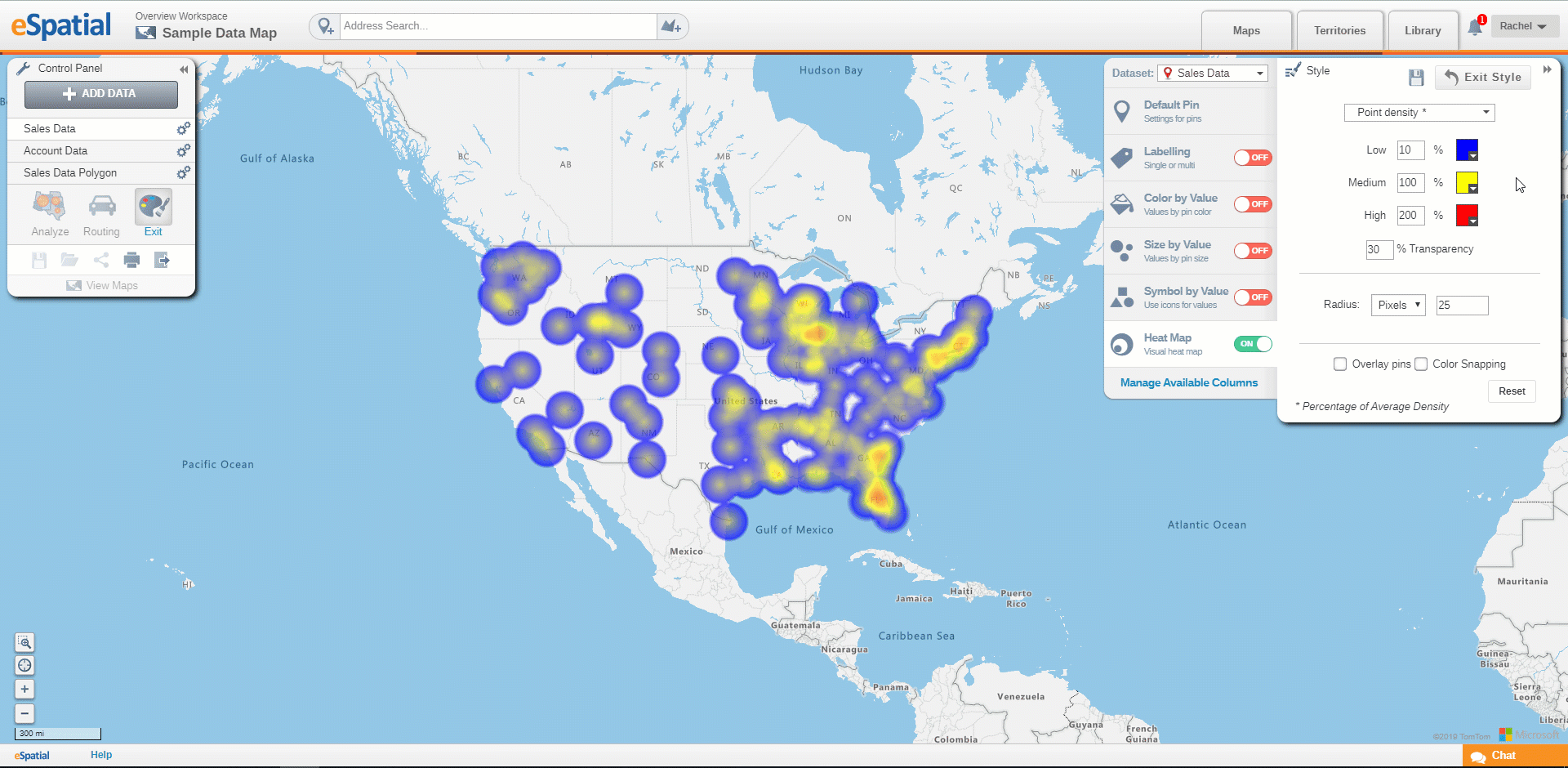
Size and Color Snapping
- Set the Radius size. You can choose from Pixels, Miles or Kilometers.
- Click on the Overlay Pins box to overlay the pins on the heatmap.
- Click on the Color Snapping box to remove the blurring between ranges and present them as bold colors.
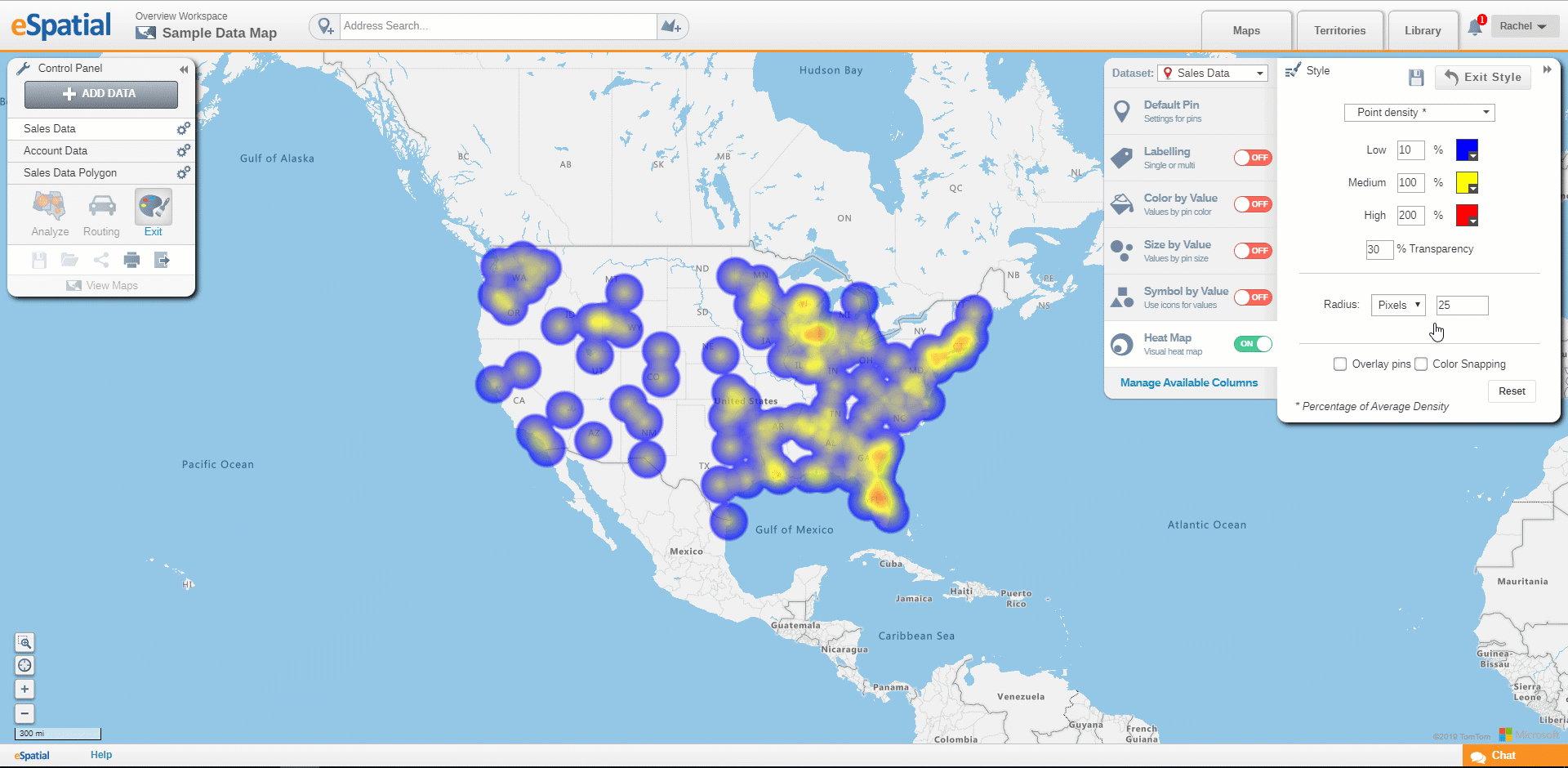
Average density is the density of the data if it was equally distributed on the map. This average density is set as 100%. At the low/10% mark, the data is at 1/10th the density of the average and at high/200% the data is at least twice the average density. The average density is calculated for an individual dataset i.e. it is different from dataset to dataset.
The radius option lets you alter the area of influence of a single point i.e. how much area a point represents/impacts.