 by
by 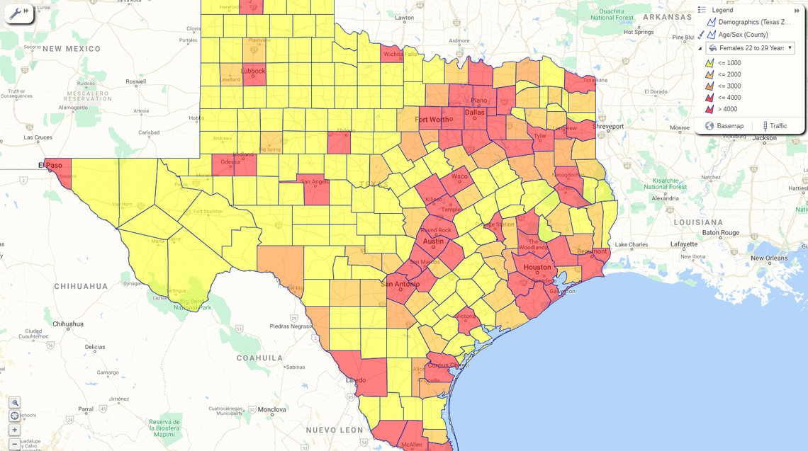
What's a color coded map?
For this example, we will look at maps with different geographic regions distinguished by different colors. For example, below is a color-coded map of France. Colors are used to indicate the different regions of France (Normandy, Bordeaux, etc.). This map also uses regional boundary files to reveal the borders of each "department" (like a US county) within a region.
If that's the map you're looking to produce and attach data to, you're in business! But, before you do anything, ensure you've got your eSpatial account up and running.
But wait… Is there another type of color coded map?
Sometimes simple color-coded maps like the one above are confused with heat maps, which use graduated colors to express values within a region. You'll find a good description of heat maps here and a link to a post explaining how to create one.
Let's make a color coded political map of the US
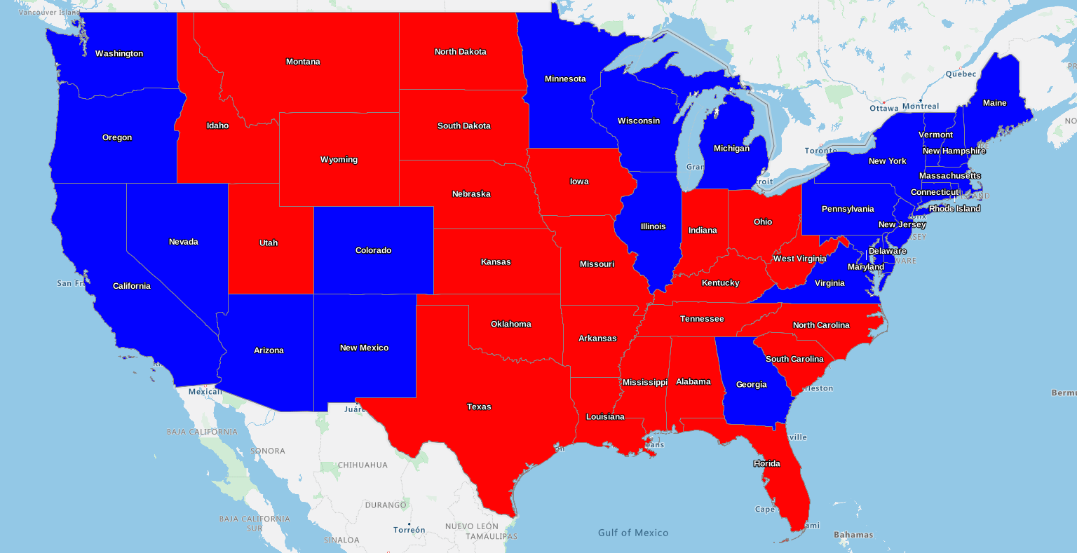
One of the most familiar types of color-coded maps – that I'm sure you would have seen on TV, online, or in newspapers – is the type that expresses election results. On these maps, a victory in a geographic region is represented by a color representing the victor. For instance, a blue-colored state would represent a Democratic victory while a red-colored state would represent a Republican state. (In the UK, it would be Labour red, Conservative blue, and Lib-Dems yellow or gold).
For the purpose of this tutorial, let's reproduce the US 2020 election results – by state. You would follow the same process for any type of color coded map that you wish to create.
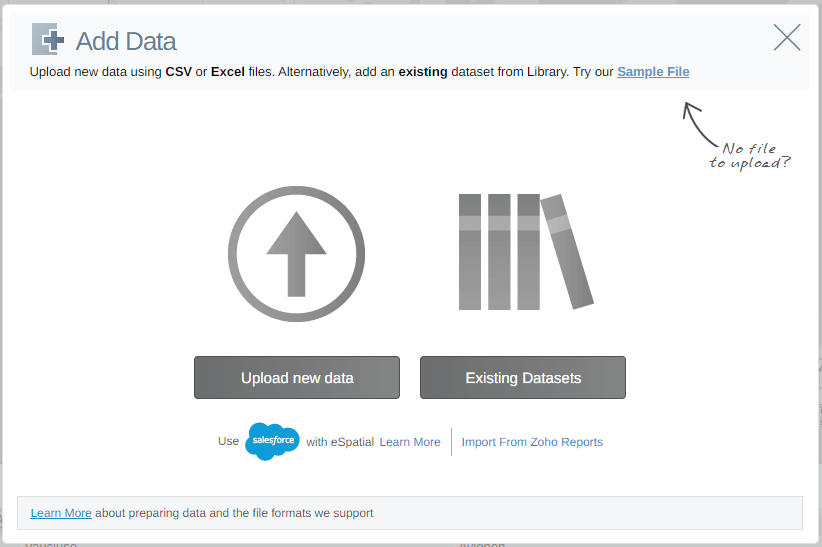
Step 1 – Upload data from an Excel spreadsheet
Log in to your eSpatial account and click Add Data to upload the US Election file, which you can download here. After clicking Add Data, you need to locate the file, open it, and upload it to eSpatial.
The Excel file we provide for this tutorial contains just two columns, listing the different states and the victorious party. If you want to do this with your own data, you can find out more about formatting data for upload to eSpatial.
Step 2 – Defining the location boundary
The easiest way to customize a color coded map in eSpatial is to link a dataset (the file being uploaded) with a pre-existing boundary dataset (US states, UK counties, etc.), which you can access from the built-in eSpatial datastore.
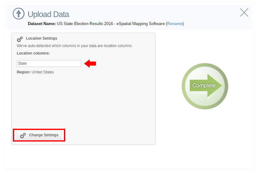
When you upload the US State Election Results 2020 CSV file, you will be shown the location column(s) (indicated by the red arrow below) that the software has found within the spreadsheet.
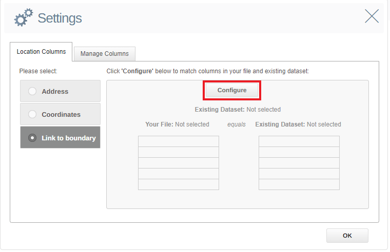
Step 3 – Link to boundary
On the next screen, select the side-menu option Link to boundary and then click Configure.
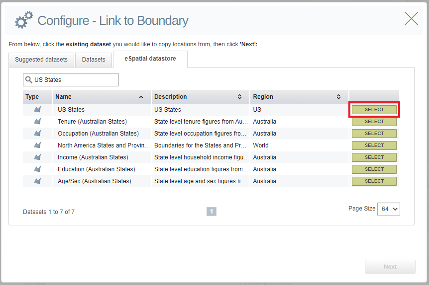
Select a geographic boundary dataset to which you can link the US Election data. In this case – because we want to create a map that reveals voting state by state – let's choose US States.
Don't panic if the boundary dataset you're looking for is not in your Datasets list. Simply click the eSpatial Datastore tab. Then scroll down or search to find the relevant boundary dataset and then just click ADD TO MAP. Click the Datasets tab again, and it should be added to the list.
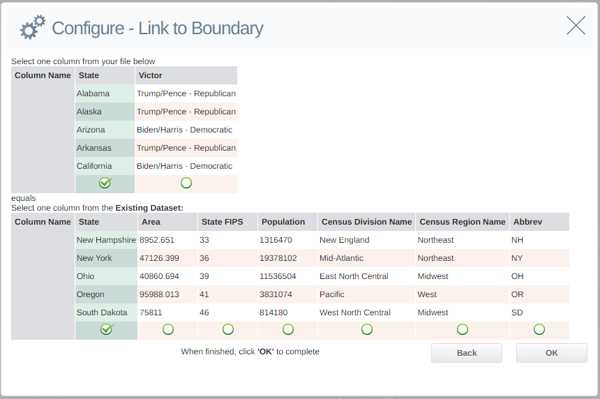
Step 4 – Connecting the data with the boundary
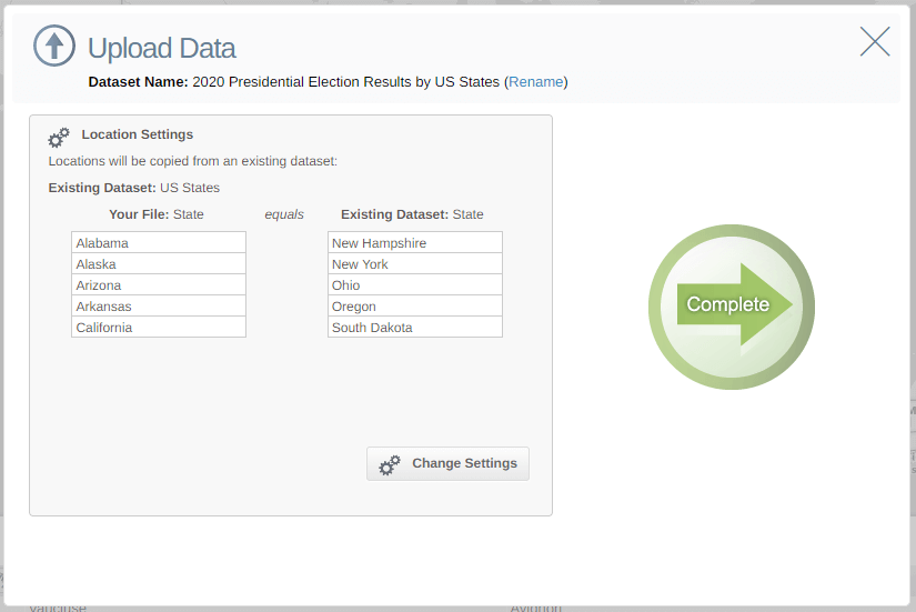
Once you have selected my boundary dataset, click Next, which brings you to a panel where you can link a field in my dataset to a field in the boundary dataset. In this case, the location element that is common to both is States, so select those. (Note – the .csv file is my uploaded file)
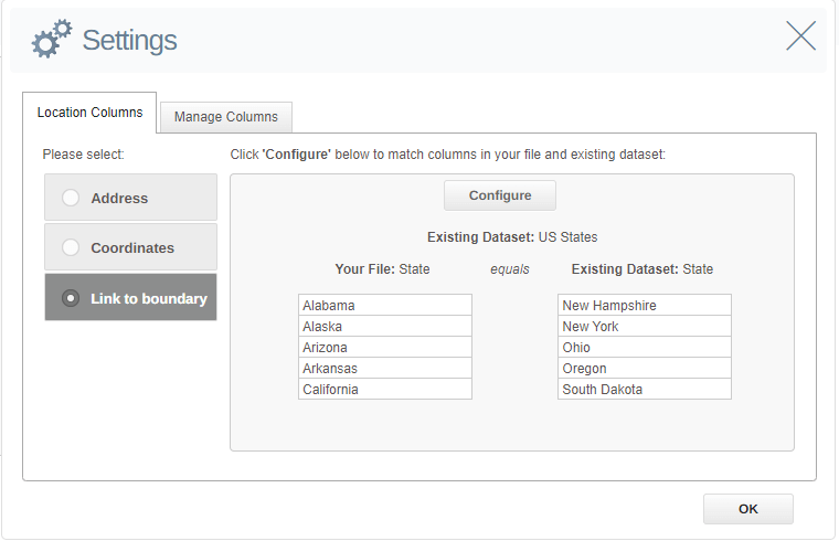
Clicking OK returns you to the Settings panel, which allows you to confirm the boundaries you are linking:
You will then be taken to another screen to upload the data and link it to the boundary dataset. Here, you can also give this combination of the uploaded dataset and boundary a new name. This will be useful if you decide to later plot a new layer of data on top of this new dataset.
All that remains to do is click Complete and the upload process will begin.
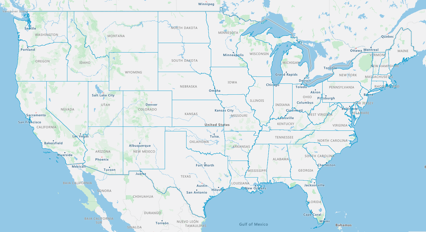
When you click Return to Map, you will initially just see the outline (borders) of the state boundaries on the map.
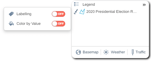
To view the states as color-coded, go to the Legend menu and click the paintbrush to the left of the dataset name.
To change the default colors on the map, click on the Style button to open the Style and Color Menu. Click on Color By Value to open those options and you can then customize the colors for to match your data. For this map we use red (#ff0000) to indicate the Republican Party and blue to indicate the Democratic Party. (#0000ff)
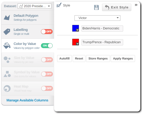
Click the save icon before closing the Style & Color menu. That's it; you have created a color-coded map of the 2020 US Election Results.